A shared language for making Stimpunks readable, humane, and usable.
We, Stimpunks
This is the writing and design playbook for Stimpunks.org. It exists so that the ideas we share — about access, neurodivergence, disability justice, and lived experience — come through clearly, honestly, and without harm. We don’t write to fit norms that erase people. We write to make room for complexity, nervous systems of all kinds, and real lives.
The guide covers how we use language, structure content, and design experiences that are usable for people with diverse attention patterns, sensory needs, and ways of making meaning. It’s practical, not perfect, and designed to help anyone contribute work that feels like Stimpunks: direct, care-centered, and grounded in real experience.
This isn’t about policing tone.
It’s about making our work readable, accessible, and humane, for readers and for the people who create it.
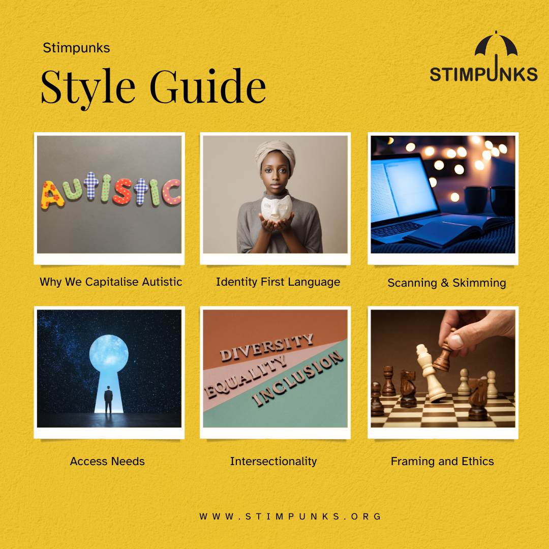
Table of Contents
- Style Guide+
- Purpose
- Voice & Authority
- Tone
- Structure & Rhythm
- Framing & Content Rules
- Identity-First Language
- Language to Prefer
- Language to Avoid
- Hyperlinks
- Block Quotes
- Sections, Hierarchy, Semantics, and Tables of Contents
- Accessible Typography
- Accessibility Commitments
- Form Accessibility
- What We Are Not
- Intersectionality Final Check
- Final Check
- Stimpunks.org Writing Style+
- Stimpunks.org Contributor Checklist (One-Page)+
- Scrollytelling: How We Tell Our Stories+
- How We Try to Make This Website More Neurodiversity-Friendly+
- Neurodiversity-Friendly Content Guidelines+
- Neurodiversity-Friendly Content Checklist+
- Em-dash Appreciation — When and Why+
- Oxford Comma Appreciation — Why We Use It+
- Dash vs. Comma vs. Colon — How We Choose+
- Stimpunks Punctuation Cheat Sheet+
- Why Sheets — House Style Guide+
- How the Style Guide Serves Accessibility+
- Further Reading+
This is a concise house style guide for Stimpunks.org. It’s written to be usable by contributors, editors, and collaborators, and to protect the voice from drift, dilution, or institutional smoothing.
Purpose
Stimpunks writing exists to surface hidden labor, challenge harmful systems, and center neurodivergent and disabled lived experience. The goal is clarity, access, and truth—not approval.
Voice & Authority
Write from lived experience
- Speak as “we” when naming shared realities.
- Authority comes from being affected, not from credentials.
- Cite research when useful, but never let it override lived truth.
- Lived experience is not monolithic; avoid flattening differences.
Center those most impacted
- Prioritize perspectives of people with intersecting marginalizations.
- Do not default to the most privileged version of disability or neurodivergence.
Take a position
- Stimpunks writing is values-forward.
- Neutrality is not required and is often harmful.
- Name injustice directly, including ableism, racism, sexism, transphobia, classism, colonialism, and capitalism where relevant.
Unapologetic, not aggressive
- Be firm and clear without attacking individuals.
- Critique systems, norms, and structures—not people struggling inside them.
Tone
Plainspoken
- Prefer simple, direct language.
- Avoid jargon unless it’s necessary—and explain it when used.
Anti-respectability
- Do not soften language to sound “professional.”
- Do not adopt nonprofit, academic, or corporate tones.
Care-centered
- Write with care for readers’ nervous systems.
- Avoid shock for its own sake.
Punk in philosophy
- Challenge power.
- Reject compliance culture.
- Prioritize survival, dignity, and access over polish.
Structure & Rhythm
One idea at a time
- Short paragraphs.
- One main idea per sentence or line whenever possible.
Scannable by design
- Use lists, line breaks, and white space.
- Assume readers may need to pause and return.
Declarative sentences
- Favor statements over hedging.
- Avoid unnecessary qualifiers (“just,” “maybe,” “kind of”).
Framing & Content Rules
Center systems, not individuals
- Frame harm as a design failure, not a personal flaw.
- Avoid language that blames people for unmet needs.
Human needs, not special needs
- Never frame access as exceptional, optional, or charitable.
- Care and access are infrastructure.
Foreground complexity
- Do not oversimplify lived reality.
- Reject binary thinking and reductionism.
Intersectionality is foundational
- Neurodivergence and disability never exist in isolation.
- Write as if multiple identities and risks are present—because they are.
Center those most impacted
- Prioritize perspectives of people facing multiple, overlapping forms of marginalization.
- When examples are used, avoid defaulting to the most privileged version of disability or neurodivergence.
Design from the edges
- Ask: Who is most excluded by this system?
- If it doesn’t work for them, it doesn’t work.
- Edge cases are stress tests, not inconveniences.
Avoid flattening experience
- Do not treat “the neurodivergent experience” or “the disabled experience” as singular.
- Frame patterns as patterns, not rules.
Name power explicitly
- Identify how racism, ableism, sexism, transphobia, colonialism, capitalism, and classism shape access and harm.
- Avoid language that individualizes or psychologizes structural violence.
Do not trade one group’s access for another’s
- Avoid framing that pits access needs against each other.
- Conflicts are design failures, not competing bodies.
Representation is not enough
- Inclusion without safety is harm.
- Visibility without power is extraction.
- Writing should reflect this distinction clearly.
Honor lived knowledge
- Do not paraphrase or sanitize marginalized voices to sound “cleaner.”
- Preserve meaning, anger, grief, and complexity.
Avoid savior framing
- Stimpunks does not “give voice” to marginalized people—we amplify voices that already exist.
- Write with people, not about them.
Assume uneven risk
- What is inconvenient for some is dangerous for others.
- Write with awareness that consequences are not distributed equally.
Access is relational
- Treat accessibility as ongoing, contextual, and collective.
- Avoid checklist or compliance framing.
Identity-First Language
Stimpunks uses identity-first language (e.g., Autistic person, not person with autism) as a default. This reflects how many Autistic and disabled people understand themselves: not as people carrying a condition, but as people whose identities, perceptions, and ways of being are inseparable from who they are.
Identity-first language affirms that neurodivergence and disability are not defects to be distanced from or softened with euphemism. They are real, meaningful aspects of identity shaped by both biology and social context. Saying Autistic is not reducing someone—it is naming a reality that deserves respect.
Why This Matters
Person-first language was designed to counter dehumanization, but in practice it often reinforces the idea that disability is something shameful, burdensome, or detachable. Identity-first language resists that framing. It recognizes that harm usually comes not from our neurology or bodies, but from systems that refuse to accommodate them.
Language shapes power. We choose words that center dignity, agency, and self-definition.
Our Practice
- We default to identity-first language throughout the site.
- We follow community-preferred terms, especially when writing about lived experience.
- We respect individual preferences when explicitly stated.
- We avoid deficit-based, medicalized, or pity-framed language unless critiquing it directly.
- We explain our choices openly rather than treating them as neutral or apolitical.
When We Name Differences
We name identities plainly and without apology. No scare quotes. No softening. No euphemisms meant to make non-disabled readers more comfortable. Comfort is not the goal—clarity and respect are.
Why We Say Autistic (In Brief)
We use Autistic because autism isn’t something we carry—it’s part of who we are. Identity-first language reflects lived experience and rejects the idea that disability is shameful or detachable. The harm isn’t autism; it’s systems built without us in mind. Naming identity plainly is an act of respect.
Capitalization: Why We Write Autistic
Stimpunks capitalizes Autistic.
We treat Autistic as an identity and culture, not a diagnosis or pathology. Capitalizing the A places Autistic people alongside other named identities and communities, rather than framing autism as a deficit or condition to be managed.
Capitalization is a small but meaningful act of resistance to medicalization and neuronormativity. Language shapes power. Lowercasing often reflects clinical distance; capitalization reflects dignity, agency, and self-determination.
Editorial guidance:
- Use Autistic (capital A) as the default.
- Prefer identity-first language (“Autistic person”) unless an individual explicitly requests otherwise.
- Respect personal preferences when quoting or referring to individuals.
- Preserve original capitalization when quoting external sources, even if it differs from Stimpunks style.
In short: Capital A for Autistic—because people are not symptoms.
Language to Prefer
- “Human needs” (not “special needs”)
- “Access” as a process, not a feature
- “Bodyminds” when relevant
- “Care,” “interdependence,” “mutual aid”
- “Systems,” “structures,” “design failures”
- “Most impacted” instead of “vulnerable”
Language to Avoid
- “Normal” as a standard
- “High-functioning / low-functioning”
- “Behavior problems”
- “Fixing” or “curing” people
- Euphemisms that hide harm
- Savior language (“giving voice,” “helping the less fortunate”)
Hyperlinks
We love hyperlinks and use them extensively. We consider them a kindness to the reader and a potent weapon in the fight against disinformation. Many of our links lead to our expansive glossary.
Semantic links rather than commercial advertisements are the life blood of the internet – the Autistic online habitat.
Jorn Bettin, author of “The Beauty of Collaboration at Human Scale: Timeless patterns of human limitations“
Block Quotes
We use block quotations (blockquote) heavily. We quote our favorite passages and sources with hyperlinks signposting back to the original work.
A block quotation (also known as a long quotation or extract) is a quotation in a written document that is set off from the main text as a paragraph, or block of text, and typically distinguished visually using indentation and a different typeface or smaller size font. This is in contrast to setting it off with quotation marks in a run-in quote. Block quotations are used for long quotations.
Block quotation – Wikipedia
Sections, Hierarchy, Semantics, and Tables of Contents
We provide content hierarchy, visual hierarchy, and tables of contents to improve skimmability and wayfinding.
Readers on the web scan for information, rather than reading everything line-by-line. Chunking your content into smaller sections, called out by larger headings, helps them find the information they’re searching for.
When I’m trying to find something quickly, there’s nothing more intimidating than jumping onto a site with a giant wall of unbroken content.
Show, Don’t Tell | CSS-Tricks – CSS-Tricks
People want to know where they’re at in the story. This doesn’t have to be fancy, you don’t need a full timeline bar like a YouTube video. But a quick outline of progress (and, if you’ve got a particularly long document, recapping your position in that outline as you go) can help ensure people that they understand their place in the overall conversation.
Make better documents. – Anil Dash
Headings are semantic and hierarchical and should be used semantically, not just for styling.
Semantic HTML is the use of HTML markup to reinforce the semantics, or meaning, of the information in web pages and web applications rather than merely to define its presentation or look.
Semantic HTML – Wikipedia
We encounter documents all the time with incoherent heading hierarchy because folks used them according to their displayed size instead of their meaning.
Hierarchical headings are important to accessibility.
A common navigation technique for users of screen reading software is to quickly jump from heading to heading in order to determine the content of the page. Because of this, it is important to not skip one or more heading levels. Doing so may create confusion, as the person navigating this way may be left wondering where the missing heading is.
The HTML Section Heading elements – HTML: HyperText Markup Language | MDN
Most screen readers can also generate an ordered list of all the headings on a page, which can help a person quickly determine the hierarchy of the content:
The HTML Section Heading elements – HTML: HyperText Markup Language | MDN
One of the best things we can do for accessibility is use headings, actual html 1-6 headings, not just text that’s been bolded and made bigger. It needs to be marked as a heading.
Accessible Typography
Typography isn’t decoration — it’s a core accessibility practice. How text looks, how it’s spaced, how clearly letters are formed, and how large it appears all affect whether people can read, understand, and stay present with what you write. When typography is inaccessible, it creates real visual and cognitive barriers that make content harder to parse, harder to focus on, and harder to complete — especially for people with low vision, dyslexia, cognitive differences, or sensory processing needs.
There is no one “magic font” that works for everyone, and designers often disagree about what’s best. But there are real design choices that reduce barriers for most readers: typefaces with clear, distinguishable characters, generous spacing, left-aligned text, sufficient size and line height, and high contrast between text and background. These choices benefit everyone — not just people with specific access needs — and are part of our commitment to inclusive, humane publishing.
Above all, the accessible typography principle at Stimpunks is this: make text that people can see, stay with, and understand without unnecessary strain. That means listening first to disabled people’s experiences, testing with real users, and making thoughtful choices about type, sizing, spacing, and contrast — not following aesthetic trends that privilege style over legibility.
Font
This article surveyed dyslexic people for their preferences and they found a list of things to look for in an accessible typeface:
The controversy of accessible type | by Alex Chen | Queer Design Club | Medium
- Is there a difference between capital I, lowercase l, and the number 1?
- Compare letters b and d, p and q — are they mirror images or distinguished?
- Compare letters g, a, and o — are they distinguished?
- Do the letters rn look like the letter m?
Font Size
Use large font sizes instead of tiny text. It’s best practice for body text to be at least 16px for web. I personally prefer 18–20px.
People should also be able to zoom in up to 200% without losing information or structure.
The controversy of accessible type | by Alex Chen | Queer Design Club | Medium
Weights and Styles
Use different weights and styles sparingly to make text simple and clean.
The controversy of accessible type | by Alex Chen | Queer Design Club | Medium
- Use sentence case, not all caps
- Don’t combine bold and italics
- Don’t create blocks of text with italics
Spacing
Use accessible spacing to differentiate lines of text and make reading easier. Best practices are:
The controversy of accessible type | by Alex Chen | Queer Design Club | Medium
- 1.5x font size for line spacing
- 2x font size for paragraph spacing
Contrast
Use high contrast to make text stand out. The text on the left is easy to read because:
The controversy of accessible type | by Alex Chen | Queer Design Club | Medium
- It uses regular instead of light weight
- It’s at 100% instead of 30% opacity
- It’s at 21:1 contrast (aim for at least 7:1)
Accessibility Commitments
- Write for multiple reading speeds and cognitive styles.
- Avoid dense blocks of text.
- Explain concepts without condescension.
- Respect sensory and emotional load.
Form Accessibility
Forms are not neutral. They can invite participation — or quietly exclude. At Stimpunks, all forms must be designed to minimize friction, respect neurodivergent and disabled realities, and serve people rather than screen them out.
This checklist defines the minimum standard for any form used by Stimpunks (intake, applications, surveys, internal ops, fundraising, or research).
Purpose & Transparency
- Every form must begin with a plain-language purpose statement.
Forms must explain:
- how information will be used
- who will have access
- what happens after submission
- Required fields must be clearly labeled; optional is the default.
Cognitive Load
- Forms must be as short as possible.
- Questions must be grouped into clearly labeled sections (use headings or lily pads).
- Avoid compound, trick, or multi-part questions.
- Remove “nice-to-have” data.
Language & Framing
- Use plain, direct language.
- Avoid institutional, legalistic, or deficit-framed wording.
- Do not assume capacity, resources, time, or executive function.
- Do not require performative professionalism.
Response Flexibility
When feasible, offer multiple ways to respond:
- text
- file upload
- audio or video
- follow-up conversation
- Avoid long narrative requirements.
- Do not impose minimum word counts unless essential.
Visual & Sensory Design
- High contrast text and backgrounds are required.
- No flashing elements, animations, or time limits.
- Long forms must be broken into sections or pages.
- Field labels must be visible (do not rely on placeholders).
Neurodiversity & Disability Inclusion
- No timers, countdowns, or urgency cues.
- Allow saving progress and returning later when possible.
- Accept varied answer styles and levels of detail.
- Design for fluctuating energy, memory, and attention.
Technical Accessibility
All forms must be:
- keyboard navigable
- screen-reader friendly
- mobile usable without loss of function
- Avoid CAPTCHAs that block disabled users; provide alternatives if unavoidable.
Error Handling
- Error messages must explain what went wrong and how to fix it.
- Entered data must not be erased on error.
- Errors should be phrased neutrally and respectfully.
Power & Safety
- Collect only information that is truly necessary.
- Do not require disclosure of diagnosis, trauma, or identity unless essential.
- When forms relate to selection, funding, or review, name the system of power involved.
- Provide a contact for questions, corrections, or accommodations.
What We Are Not
- Not neutral
- Not polite to harmful systems
- Not assimilationist
- Not charity-focused
- Not productivity-obsessed
Intersectionality Final Check
Before publishing, ask:
- Who is centered here—and who is missing?
- Whose risk is acknowledged, and whose is ignored?
- Does this treat complexity as real, or as an inconvenience?
- Does this reinforce power, or challenge it?
If it flattens, revise.
If it erases, stop.
Final Check
Before publishing, ask:
- Does this center lived experience?
- Does it name systems, not blame individuals?
- Does it protect access and dignity?
- Does it sound like Stimpunks—or like an institution?
If the answer isn’t yes, revise.
Plainspoken and uncompromising
The writing avoids academic fog and corporate euphemism. Sentences are direct, declarative, and grounded in real experience. If something causes harm, it’s named plainly.
Lived-experience–first
Authority comes from being affected, not from credentials. The voice speaks from inside neurodivergent and disabled life, not about it from a distance.
Anti-respectability, anti-assimilation
The style refuses to sound “professional” at the expense of truth. It does not soften language to make systems comfortable or palatable.
Values-forward, not neutral
There is no pretense of objectivity. The writing clearly takes sides: against neuronormativity, coercion, behaviorism, and ableism; for care, access, and interdependence.
Short, declarative lines
Ideas are often delivered one per line or one per sentence. This improves accessibility, readability, and rhetorical impact.
Foregrounds systems, not individual blame
Problems are framed as systemic design failures rather than personal shortcomings. People are not pathologized; structures are.
Complex without being obscure
The writing does not oversimplify reality, but it avoids jargon. When complex ideas appear, they are grounded in everyday language and examples.
Care-centered and justice-oriented
Care is treated as infrastructure, not sentiment. Justice is structural, not symbolic. These themes recur consistently.
Punk in philosophy, not costume
The voice is rebellious, but not flippant. It challenges power, rejects hierarchy, and centers survival over polish.
Invitational but not apologetic
Readers are welcomed in, but the writing does not ask permission or dilute its claims. It assumes the right to exist, speak, and demand change.
Designed for nervous systems
Spacing, rhythm, and repetition are used intentionally. The style supports skimming, pausing, and re-entry—reflecting sensory and cognitive access needs.
Voice & Authority
- Speak from lived experience; name whose “we” you are centering.
- Center those most impacted; prioritize intersecting marginalizations.
- Name injustice clearly—systems, structures, and harm.
- Avoid neutral or polite tones that protect power.
Tone & Style
- Plainspoken, direct, values-forward.
- Anti-respectability; reject corporate, academic, or nonprofit flattening.
- Care-centered: consider nervous system, cognitive load, and trauma.
- Punk: challenge hierarchy, power, and compliance culture.
Structure & Clarity
- One idea per sentence or line.
- Short paragraphs; use lists and line breaks.
- Declarative statements, avoid hedging.
- Make content scannable and re-entry friendly.
Framing & Ethics
- Frame harm as systemic; avoid blaming individuals.
- Access is human right, care is infrastructure, not optional.
- Foreground complexity; avoid flattening experience.
- Design from the edges: if it doesn’t work for the most excluded, it doesn’t work.
- Intersectional: consider race, class, gender, sexuality, culture, and language in context.
- Avoid pitting access needs against each other.
Language
Use: human needs, bodyminds, care, interdependence, mutual aid, systems, structures, most impacted.
Avoid: “normal,” high/low-functioning, “behavior problems,” “fixing” people, charity framing, savior language.
Accessibility
- Write for multiple reading speeds and cognitive styles.
- Avoid dense blocks; explain concepts clearly.
- Respect sensory and emotional load.
Intersectional Final Check
- Who is centered? Who is missing?
- Whose risk is acknowledged, whose is invisible?
- Does this challenge power or reinforce it?
- Are multiple marginalized perspectives represented?
Final Check
- Does it sound like Stimpunks, not an institution?
- Does it name systems over individuals?
- Does it protect access, dignity, and safety?
- If any answer is “no,” revise before publishing.
At Stimpunks, we use scrollytelling — a blend of scrolling + storytelling — to make complex ideas come alive in ways that are engaging, accessible, and respectful of different ways of reading and learning. Instead of dense blocks of text, our pages are laid out so you can grasp the most important ideas first and then choose how deep you want to go as you scroll.
Stimpunks uses scrollytelling as both a design choice and a care practice. Our pages unfold vertically, like webtoons, longform comics, or oral stories told at a walking pace. Meaning is revealed gradually, with space to pause, reflect, or stop entirely.
What Scrollytelling Means Here
Scrollytelling is the practice of guiding a reader through a narrative experience as they scroll down a page, layering plain-language ideas with deeper, richer context, stories, media, and reflections. At the top, you’ll find clear language that gives you the gist. As you scroll, you’ll encounter more nuance, background, examples, and connected voices.
Why We Use It
We know that people come to Stimpunks with different needs, attention patterns, and contexts. Some readers need just the main idea, others want depth and detail, and many fall somewhere in between. Scrollytelling lets everyone read at the pace they choose — so neither surface understanding nor deeper exploration is privileged over the other.
How It Works (Our Conventions)
Here are the building blocks of our scrollytelling style, designed with accessibility, clarity, and engagement in mind:
Front-load key points
Main concepts are presented early in plain language so you can get the gist quickly.
Multimodal content
We mix talk (text), media (images, music, video), and narrative elements so the experience isn’t just text on a page — it’s lived, felt, and heard.
Breaks and whitespace
Pauses, spacers, and careful spacing give your eyes and mind room to rest — especially important for sensory and attention differences.
Accordions and definitions
Expandable sections let you dive deeper only if you want to, with labels like “What is…” and “In other words…” to orient you.
Lists and skimmable design
We use bullets, bolded key sentences, and grouped blocks so you can skim or read in depth without losing meaning.
Tables of contents and visual signposts
Longer pages include mini-TOCs and signposts so you always know what’s coming next.
Conversational voice and humor
Because dryness erases people. We write the way people actually think and speak — with jokes, feelings, and humanity.
Influenced by Webtoons and Comics
Our storytelling is deeply influenced by webtoons and comics, where pacing is controlled by vertical movement and meaning lives in the spaces between panels. In comics, those spaces are called gutters—the blank space where readers make sense of what just happened.
On Stimpunks, whitespace is a gutter.
It’s where:
- your nervous system gets a break
- ideas have room to land
- readers decide whether to keep going
We don’t rush you past the hard parts.
Pace Is Part of Accessibility
Scrolling pace matters. Fast, dense content assumes urgency, stamina, and linear attention. We reject that assumption.
Our pages are built so you can:
- read a headline and stop
- take in one idea at a time
- skim without losing the core meaning
- scroll slowly without penalty
This mirrors how many neurodivergent people actually process information: in bursts, loops, pauses, and returns.
Gutters, Not Walls
Instead of walls of text, we use:
- short sections
- visual breaks
- lists and callouts
- expandable definitions
- lilypads
These are not stylistic flourishes. They are narrative gutters—intentional gaps that invite interpretation rather than overload.
We trust readers to do meaning-making themselves.
Story Over Extraction
Scrollytelling lets us layer:
- plain-language explanations first
- deeper context later
- stories before abstractions
- lived experience before theory
You don’t have to “finish” a page for it to work. If you leave halfway through, the story still respects you.
How This Feels in Practice
As you scroll, a Stimpunks page unfolds like a story: you encounter definitions, examples, voices from community, visuals, and explanations that expand on ideas only after you’ve seen the core meaning. This mirrors how people actually learn: start simple, then explore complexity when ready.
Read at Your Own Depth
You’re invited to read what you want and skip what you don’t. If you only scroll enough to see the headings and initial explanations, you’ll still get the essential idea. If you’re curious or have more time, the rest of the page rewards you with layered context, linked concepts, and reflections from lived experience.
You are allowed to:
- scroll quickly
- scroll slowly
- skip sections
- come back later
Nothing here is a test.
Our storytelling style assumes that attention is precious, energy is uneven, and understanding unfolds over time. We design accordingly.
We intentionally design Stimpunks.org for people who think and pay attention in many different ways. Pages that are long blocks of text are one of the hardest formats for many visitors to engage with, so we use multiple techniques to make information easier to find, absorb, and navigate.
Structural & Visual Support
- Whitespace and breaks — Plenty of empty space helps reduce visual clutter and allows the eye to rest.
- Attention getters — Pull quotes, bolded phrases, colored backgrounds, and visual groupings make key ideas stick and support quick scanning.
- Visual hierarchy — Clear headings, subheadings, and bullet lists help you jump to what matters most without getting lost.
- Consistent layout — Pages use a predictable format so you always know where to find the main idea, deeper context, and “definitions in other words.”
Language & Writing Practices
- Conversational tone — We write the way people actually talk and think, not in dense academic prose.
- Short units of meaning — Breaking information into small sections and bullet points prevents overload and supports attention shifts.
- Plain language + visuals — Definitions and explanations are offered right where they’re needed, often with visual cues or inline clarifications.
Interactive Elements
- Accordions — Expandable “What is…” and “In other words…” sections let you go deeper only if you want to.
- Search tools — Multiple search boxes (top, footer, inline) help you find topics without reading every page.
Audio & Multi-Modal Access
- Text listening — Pages are compatible with AI-generated audio so you can listen instead of read, reducing strain and supporting different attention needs.
Design Philosophy
- Skim-first design — Every page is meant to work even if you only read the headers and key points.
- Engaging and visual — We use images, color blocks, and formatting that feel alive rather than flat text walls.
- Single-resource structure — Everything lives in one place with consistent navigation so you don’t get overwhelmed by scattered sites.
Cognitive Accessibility Principles
These practices align with broader ADHD-friendly and cognitive accessibility guidance — such as simplifying layout, breaking content into digestible chunks, minimizing distractions, and using clear headings and navigation to support focus and comprehension.
How I Made My Book ADHD-Friendly
Follow this advice from Jessica of How to ADHD:.
How I Made My Book ADHD-Friendly 🧠📘 – YouTube
- Lots of whitespace.
- Every page/screen has something breaking up the text. Break up text with pull quotes, blocks, bullets, bolding, backgrounds, images.
- Add attention getters like selective bolding and pull quotes.
- Write in conversational style.
- Organize so you don’t have to read it.
- Flip open right to your struggle. Allow people to pick up and go right to what they need.
- Format is the same for every chapter.
- Make it so people can just read the headers.
- Make it engaging and visual.
- Add in jokes and feelings.
- Put everything in one book so folks have one place to go.
Stimpunks content is designed for real brains in real conditions. Many of our readers (and contributors) are ADHD, autistic, or cognitively overloaded. Our writing and layout choices should reduce friction, not demand focus, stamina, or linear attention.
These guidelines are not rules. They’re supports.
Core Principle
If someone only reads part of the page, it should still work.
Structure & Flow
- Lead with the main idea. Don’t bury it.
- Use short sections with clear, descriptive headings.
- Avoid dense walls of text; break content into manageable chunks.
- White space is a feature, not wasted space.
Skimmability
- Pages should make sense by scanning headings alone.
- Use bold to signal key ideas.
- Prefer lists and grouped blocks over long paragraphs.
- Keep related ideas together.
- Lily Pads (see below) provide visual and conceptual anchors for scanning and comprehension.
Language
- Use plain, direct language.
- Write like a human speaking to another human.
- Explain jargon where it appears—or avoid it.
- Short sentences are better than long ones.
- Repetition is allowed when it aids understanding.
Pace & Cognitive Load
- One main idea per section.
- Don’t stack multiple new concepts at once.
- Let ideas land before adding more.
- Assume readers may pause, leave, and return later.
- Scrollytelling: Use vertical flow, pacing, and visual gutters to let meaning settle.
Lily Pads
What they are:
Lily pads are small, digestible stepping stones that let readers pause, process, and choose their next move. On Stimpunks.org, lily pads are implemented as colored blocks or grouped sections to make the structure visually clear.
How to use them:
- Break dense content into labeled subsections.
- Use colored blocks/groups as visual landing points.
- Add anchors or signposts to indicate progression.
- Include optional “Go deeper” or expandable sections.
- Insert intentional whitespace for pause-and-reflect moments.
Why it matters:
Lily pads reduce cognitive load, support neurodivergent attention patterns, and let readers navigate content at their own pace. They transform complex ideas into approachable, visual stepping stones.
Lily Pads & Memory Craft:
Lily pads support Memory Craft by giving ideas clear places to land, rest, and be found again. They break information into visually distinct, self-contained blocks that reduce cognitive load, support recognition over recall, and make non-linear reading possible. Because lily pads are implemented as colored groups or blocks, readers can pause, skim, leave, and return without losing orientation or being forced to hold context in working memory. This shifts the burden of remembering from the reader to the environment — a core Memory Craft principle — and makes the site more usable for neurodivergent, disabled, fatigued, or interrupted readers.
Lily pads work like modern illuminated manuscripts: just as medieval scribes used images, color, and layout to help readers remember and navigate complex texts, lily pads use colored blocks and distinct groups to anchor ideas on the page. They give concepts clear places to land, reduce cognitive load, and support recognition over recall, letting readers pause, skim, leave, and return without losing orientation. By turning memory into a feature of the environment instead of a burden on the reader, lily pads make Stimpunks.org usable for neurodivergent, disabled, or interrupted readers — guiding attention and understanding like visual cues in a manuscript once did.
Optional Depth
- Use expandable sections (accordions) for extra detail.
- Label them clearly (“In other words…”, “Go deeper…”).
- Skipping optional content should never break comprehension.
Visual & Sensory Care
- Avoid cluttered layouts.
- Don’t rely on color alone to convey meaning.
- Images should support understanding, not distract.
- Calm, readable design beats flashy presentation.
Reader Permission
- Explicitly allow skimming, skipping, and stopping.
- Never shame readers for not finishing or focusing.
- Curiosity matters more than urgency.
Editorial Check
Before publishing, ask:
- Would this still make sense if someone is tired?
- Does it work if only half the page is read?
- Does this reduce cognitive load—or add to it?
You don’t need to do all of these. Do what you can. Every small improvement helps.
Structure & Layout
- ☐ Start with the main idea first (don’t bury the lede)
- ☐ Use short sections with clear headings
- ☐ Break long text into small chunks (paragraphs, bullets)
- ☐ Avoid big walls of text whenever possible
- ☐ Add white space—space helps thinking
Scanning & Skimming
- ☐ Make sure someone can get the gist by reading headings only
- ☐ Use bold to highlight key ideas (sparingly)
- ☐ Prefer lists over dense paragraphs
- ☐ Group related ideas together
- Lily Pads: colored blocks & grouped content act as stepping stones
Language
- ☐ Use plain, direct language
- ☐ Write like a human, not a paper
- ☐ Explain jargon where it first appears
- ☐ Shorter sentences > longer ones
- ☐ It’s okay to repeat important ideas
Pace & Cognitive Load
- ☐ One main idea per section
- ☐ Don’t stack too many concepts at once
- ☐ Let ideas land before adding more
- ☐ Assume the reader may stop and come back
- Scrollytelling: vertical flow, pacing, gutters guide comprehension
Lily Pads
- ☐ Use digestible content blocks → colored visual groups
- ☐ Label subsections clearly
- ☐ Add anchors & optional “Go deeper” sections
- ☐ Insert pauses / whitespace for reflection
- Purpose: reduce cognitive load, support attention differences, guide readers at their own pace
Optional Depth (Not Required)
- ☐ Use accordions / expandable sections for extra detail
- ☐ Label them clearly (“In other words…”, “Go deeper…”)
- ☐ Make sure skipping them doesn’t break understanding
Visual & Sensory Care
- ☐ Avoid cluttered layouts
- ☐ Don’t rely on color alone to convey meaning
- ☐ Images should support understanding, not distract
- ☐ Calm > flashy
Tone & Permission
- ☐ Explicitly tell readers they can skim, skip, or stop
- ☐ Don’t shame people for not reading everything
- ☐ Curiosity > urgency
Final Gut Check
- ☐ Would this still make sense if someone is tired?
- ☐ Would it work if someone only reads half of it?
- ☐ Does this reduce friction—or add it?
Visual Reminder
Lily Pads = colored blocks / grouped content
Scrollytelling = pacing + gutters
ADHD-friendly = chunked info, whitespace, flexible navigation
Remember
This site is built for real brains in real conditions.
Perfect focus is not required. Neither is perfection.
The em-dash (—) is one of our favorite tools for humane writing. It lets us signal a pause, an aside, a shift in thought, or a breath in a way that feels natural and conversational — especially for readers with ADHD, dyslexia, or other attention differences.
Our Use of the Em-dash
Use an em-dash to:
- Break for emphasis
“This is not about fixing people — it’s about redesigning systems.” - Add a meaningful aside
“Many organizations hide context — the why and the how — behind jargon.” - Mark a shift or contrast
“We don’t chase scale — we chase usefulness.” - Give space to thought without breaking flow
“You don’t have to finish the whole page — you can stop here — and still understand the point.”
Why It Matters
- Friendly pacing: Em-dashes create breathing room in a sentence without pulling the reader into a new paragraph.
- Human tone: They mimic real speech rhythms — important for engagement and comprehension.
- Cognitive support: For many readers, a dash helps chunk information and signals where a thought changes without a formal break.
How We Write It
- Use spaces on either side: idea — continuation
- Prefer em-dashes over commas when you want to highlight a break in thought
- Do not overuse — too many in a row can fragment meaning
Examples
✔ Better:
“The work isn’t easy — and it shouldn’t have to be hidden.”
✔ Less clear:
“The work isn’t easy, and it shouldn’t have to be hidden.”
Quick Rule
Choose the em-dash when you want meaning to pause — not stop.
Odes to the Em-dash
Understand the rhythm of writing—the beats beneath the words.
The Em Dash Is NOT an AI Tell: Justice for the Em Dash! – Ann Handley
The em dash is punctuation with feeling.
It’s how writers think on the page. How we change direction mid-thought, add a beat of surprise, or let a little chaos in for flavor.
The Em Dash Is NOT an AI Tell: Justice for the Em Dash! – Ann Handley
AI models love the em dash… because humans do.
The Em Dash Is NOT an AI Tell: Justice for the Em Dash! – Ann Handley
Who’s actually robotic? The writer using rhythm and nuance? Or the reader following a rulebook?
The Em Dash Is NOT an AI Tell: Justice for the Em Dash! – Ann Handley
We use the Oxford comma (also called the serial comma) because it improves clarity, pacing, and accessibility. The extra comma helps readers see how items are grouped, reduces moment-to-moment ambiguity, and lowers cognitive load — especially for readers who process text literally, visually, or sequentially.
What the Oxford Comma Does Well
- Clarifies grouping
It makes it immediately clear which items belong together and which do not. With Oxford comma:
“We support artists, educators, and disabled organizers.”
Without:
“We support artists, educators and disabled organizers.” - Improves pacing
The comma adds a subtle pause that helps the reader track lists without rereading. - Reduces cognitive strain
Clear grouping matters for autistic readers, dyslexic readers, screen-reader users, and anyone scanning quickly. - Prevents accidental meaning
Without it, lists can unintentionally imply relationships that don’t exist. Ambiguous:
“We thank our parents, Alex and Jordan.”
Clear:
“We thank our parents, Alex, and Jordan.”
Stimpunks Standard
- We always use the Oxford comma in lists of three or more items.
- Consistency matters more than style trends.
- When clarity conflicts with minimalism, clarity wins.
Rule of Thumb
If removing a comma makes a reader stop and think, reread, or guess — put it back.
Accessibility favors explicit structure.
Punctuation shapes pacing. At Stimpunks, we choose marks based on how we want a sentence to feel in the body, not just what grammar allows.
Use a Comma (,) for Flow
Commas keep ideas moving smoothly. They’re best when thoughts are closely related and don’t need emphasis.
Use when:
- Listing items
- Connecting short, simple clauses
- Maintaining a steady, neutral rhythm
Example:
“We design for real life, not ideal conditions.”
Use an Em-dash (—) for Meaningful Pauses
Em-dashes signal a shift, an aside, or emphasis. They invite the reader to slow down just enough to notice something important.
Use when:
- Adding context or nuance
- Marking contrast or tension
- Mimicking spoken thought
- Supporting ADHD-friendly chunking
Example:
“We design for real life — messy, uneven, and human.”
Rule of thumb:
If you want the reader to feel the pause, use a dash.
Use a Colon (:) to Set Up What Comes Next
Colons tell the reader: pay attention — this explains or delivers something specific.
Use when:
- Introducing a definition
- Presenting a list or conclusion
- Naming a core idea, rule, or takeaway
Example:
“We design for one reason: people deserve tools that work.”
Rule of thumb:
If the second part depends on the first, use a colon.
Quick Decision Guide
- Smooth continuation? → comma
- Pause, emphasis, or aside? → em-dash
- Announcement, payoff, or explanation? → colon
Stimpunks Preference
When in doubt, choose the punctuation that:
- reduces cognitive load
- sounds like a real human talking
- helps the reader breathe and stay oriented
Grammar serves understanding — not the other way around.
Choose punctuation by feel and flow, not just rules.
Comma ( , ) — Keep It Moving
Use for: flow, lists, gentle connections
Feels like: smooth, continuous
Example:
“We build tools that work in real life, not ideal conditions.”
Em-dash ( — ) — Pause With Purpose
Use for: emphasis, asides, contrast, breath
Feels like: spoken language
Example:
“We build tools — tested at the edges — for real people.”
Style: no spaces on either side
Colon ( : ) — Set Up the Point
Use for: definitions, lists, payoffs
Feels like: here it is
Example:
“Our rule is simple: design for humans first.”
Period ( . ) — Full Stop
Use for: clarity, certainty
Feels like: grounded, complete
Example:
“This matters.”
Semicolon ( ; ) — Rare, Intentional
Use for: closely linked ideas that need separation
Feels like: thoughtful, formal
Example:
“We design carefully; people live with the consequences.”
Note: If a dash works, prefer the dash.
Parentheses ( ) — Use Sparingly
Use for: optional info only
Feels like: whisper
Example:
“This tool works (most days).”
Preference: If it matters, use a dash instead.
Question Mark ( ? ) — Invitation
Use for: reflection, opening space
Feels like: curious, human
Example:
“What would this look like if it worked for you?”
Stimpunks Rule of Thumb
If punctuation:
- helps the reader breathe → good
- adds friction → simplify
- hides meaning → rewrite
Clarity over correctness. Always.
Why Sheets are short, plain-text explainer pages. Their job is to answer why we do something without overwhelm, flourish, or persuasion. They prioritize clarity, scannability, and cognitive ease over voice or aesthetics.
Think: calm, honest, useful.
Purpose of a Why Sheet
A Why Sheet exists to:
- Explain intent and rationale, not defend decisions
- Reduce cognitive load and emotional labor for readers
- Be readable by tired, distracted, or overwhelmed people
- Serve as a quick reference, not a long essay
If a page feels like an argument, manifesto, or brand story, it is not a Why Sheet.
Visual & Text Palette
Why Sheets intentionally use a simplified presentation.
Use:
- Plain text backgrounds
- Minimal color (default text + neutral accents only)
- No decorative imagery or complex layout
- Generous white space
Avoid:
- Gradients, textures, or background images
- Heavy visual hierarchy or design flourishes
- Dense blocks of text
The goal is quiet readability.
Structure & Layout
Why Sheets follow a predictable, repeatable structure.
Required Elements
- Clear page title (
Why X,Why We Y,Why This Exists) - Short introductory paragraph (2–3 sentences max)
- Multiple scannable sections with headings
- Bulleted lists where possible
Recommended Flow
- What this is
- Why it exists
- What it does (and doesn’t do)
- Who it’s for
- How to use it (optional)
Consistency matters more than creativity.
Headings
Headings should be:
- Short (unless using a pullquote as a heading)
- Literal
- Descriptive
Good:
Why This ExistsWhat This Is NotWho This Is ForHow to Use This
Avoid:
- Clever or metaphorical headings
- Questions as headers (unless clarity demands it)
Headings are navigational tools.
Bulleted Lists
Bullets are preferred over paragraphs whenever possible.
Bullets should:
- Be concise (one idea per bullet)
- Start with active, concrete language
- Avoid sub-clauses or long explanations
Good:
- Reduce confusion
- Set expectations
- Share context without persuasion
Avoid:
- Nested bullets more than one level deep
- Paragraph-length bullets
If a list grows long, break it into sections.
Paragraph Style
When paragraphs are used:
- Keep them short (1–3 sentences)
- Use plain, direct language
- Avoid rhetorical build-up
Do not:
- Stack multiple ideas in one paragraph
- Assume reader familiarity
- Use emotionally charged language
Why Sheets explain. They do not sell.
Tone
Tone should be:
- Calm
- Respectful
- Non-defensive
- Non-performative
Why Sheets do not:
- Justify existence through urgency or crisis language
- Use inspirational or motivational framing
- Ask for buy-in
They assume good faith and shared humanity.
Language Guidelines
- Use plain language
- Prefer short sentences
- Define terms only if necessary
- Avoid jargon, acronyms, and insider references
If a term requires explanation, ask:
Does this term actually need to be here?
Accessibility Notes
Why Sheets should:
- Be fully readable without visual context
- Work when skimmed or partially read
- Avoid time pressure (“must,” “now,” “urgent”)
- Respect fluctuating attention and energy
Why Sheets are designed for low-spoons moments.
Final Check (Contributor Checklist)
Before publishing, ask:
- Can this be understood in under 2 minutes?
- Can someone skim it and still get the point?
- Does it feel calm rather than persuasive?
- Is the structure doing the work, not the tone?
If yes — it’s a Why Sheet.
The Style Guide is more than a set of writing rules — it’s a tool for inclusion. It ensures that the language, layout, tone, and presentation of Stimpunks content are usable by people with a range of sensory, cognitive, attentional, and physical needs. Accessibility isn’t an add-on; it’s baked into how we communicate.
1. Language That Meets Real Brains
The Guide promotes:
- Plain language over jargon
- Short sentences and clear structure
- Explanations of terms where they appear
These choices reduce cognitive load and help readers who process information non-linearly, have language differences, or struggle with dense text.
2. Visual Structure That Supports Reading
The guide encourages:
- Lily pads (colored blocks/groups)
These act as visual anchors, letting readers pause, regroup, and navigate at their own pace. - Headings and signposts
So readers can orient themselves without reading every word. - Whitespace and breaks
Reducing visual clutter and providing space for processing.
These elements help readers with ADHD, dyslexia, visual processing differences, and sensory sensitivities by making meaning easier to find and sustain.
3. Rhythms and Pacing That Respect Attention
The guide steers contributors to use:
- Scrollytelling patterns
Which pace information with intent. - Lists, bullets, and modular chunks
So attention can land, rest, and move again without overload.
This makes reading less exhausting and helps people engaging in bursts or fragmented sessions.
4. Inclusive Tone and Permission
The Guide asks writers to:
- Explicitly permit skimming, stopping, and skipping
- Avoid shaming language
- Respect that readers arrive with different capacities and contexts
This supports emotional accessibility as much as cognitive — no one is made wrong for engaging differently.
5. Punctuation and Visual Cues
By standardizing things like:
- Em-dash usage for meaningful pauses
- Oxford commas for clarity
- Accessible typography choices (clear letterforms, contrast, spacing)
the Guide ensures that text structure itself doesn’t become a barrier. These conventions aid comprehension for screen readers, scanning readers, and people with sensory needs.
6. Multiple Expression Paths
The Guide encourages:
- Alternative response formats (audio, visual, text)
- Expandable sections (“In other words…”, “Go deeper…”)
- Recognition of different reading patterns
This supports people who read non-linearly, use assistive tech, or have fluctuating capacity.
7. Continuous Reflection
The Style Guide isn’t a fixed rulebook. It’s written to:
- evolve with lived experience
- be transparent about why choices are made
- invite feedback and adaptation
This embodies accessibility as an ongoing practice, not a checklist.
In Sum
The Style Guide serves accessibility by shaping how meaning is offered, structured, and experienced. It doesn’t ask people to adapt to the content. Instead, it designs content to adapt to people — especially those whose brains and bodies have been left out of dominant design norms.
Accessibility at Stimpunks isn’t about compliance.
It’s about respect, care, and real usability.
- Make better documents. – Anil Dash
- Show, Don’t Tell | CSS-Tricks – CSS-Tricks
- How I Made My Book ADHD-Friendly 🧠📘 – YouTube
- 📚🌈♿️ An Encyclopedia of Disability and Difference – Stimpunks Foundation
- Design for Real Life
- How to set up your own digital garden – Ness Labs
- The Garden and the Stream: A Technopastoral – Hapgood
- A Brief History & Ethos of the Digital Garden
- Default to open – Proudly Serving
- Thin Description and Data Visualization – Methodological Play – 100 Years of New Media Pedagogy
- Multimodal Performance – Methodological Play – 100 Years of New Media Pedagogy
- Liz Jackson: Designing for Inclusivity – 99U
- Twenty Things to Do with a Computer Forward 50: Future Visions of Education Inspired by Seymour Papert and Cynthia Solomon’s Seminal Work
- Everything is a Remix Remastered (2015 HD) – YouTube
- Weaving the Web (Act 4, Page 3) – Conversing With Computers – 100 Years of New Media Pedagogy
- Korean webtoons, the history and culture: Why they inspire K-dramas like The Uncanny Counter, Sweet Home | Friday-art-people – Gulf News
- The Webtoon: A New Form for Graphic Narrative – The Comics Journal
- How to Panel Your Webtoon – by Nicole Cornball
- What’s with the whitespace on manhwa? : r/manga
- Manhwa and Manga: Similar but Different Art Forms – Anime News Network
- Why do webtoons tend to have so much blank space? : r/webtoons
- Manhwa vs Manga…. Why so much white space? : r/manga
- The Beauty of Collaboration at Human Scale: Timeless patterns of human limitations
- The HTML Section Heading elements – HTML: HyperText Markup Language | MDN
- The controversy of accessible type | by Alex Chen | Queer Design Club | Medium
- Nutshell: make expandable, embeddable explanations
- VandeHei, Jim; Allen, Mike; Schwartz, Roy. Smart Brevity: The Power of Saying More with Less. Workman Publishing Company.
- Writing great alt text: Emotion matters – JakeArchibald.com
- Text descriptions and emotion rich images – Tink – Léonie Watson
- How to create a digital story in WordPress • Yoast
- The Future of Text || – Future Text Publishing
- How To Explain Things Real Good (Stanford mini-talk)
- Memory Craft a book by Lynne Kelly
- The Official Em Dash Home Page
- Introducing the Gutenberg Interactive Fiction Engine – ArtemioSans
- Enjoy our interactive exhibit – MOBA

