
Design here is an access decision, not decoration. How a page reads on a bad day, which colors sit behind text for hours at a stretch, whether a layout still works at 200% zoom — those are access questions, and we answer them in public.
This section is our own design practice: the choices we made for stimpunks.org and the reasoning behind them. It sits alongside Reading Experience in the IT Field Guide, which covers how those choices are implemented, and the House Style Guide in Editorial, which covers how we write. Those three are one practice split across three sections — build access into the foundation rather than bolting it on afterward, which is also why we refuse accessibility overlays.
Looking for the Design Method?
Our public framework for designing neurodivergent environments lives at The Stimpunks Design Method — ARLES: Attention, Relational, Lived Experience, Environment, Systems.
- The Stimpunks Quickstart Guide — the short version, including the Practice Loop.
- Neurodivergent Design Principles — the ideas underneath the method.
- Cavendish Space, SPACE-TIME, and The Stimpunks Design Method — the research-grounded synthesis.
- Pattern Language of Neurodivergent Life and Neurodivergent Environments — the patterns the method works from, and the settings it works on.
That is design we publish for other people to use.
This section is design we practice on ourselves.
In This Section
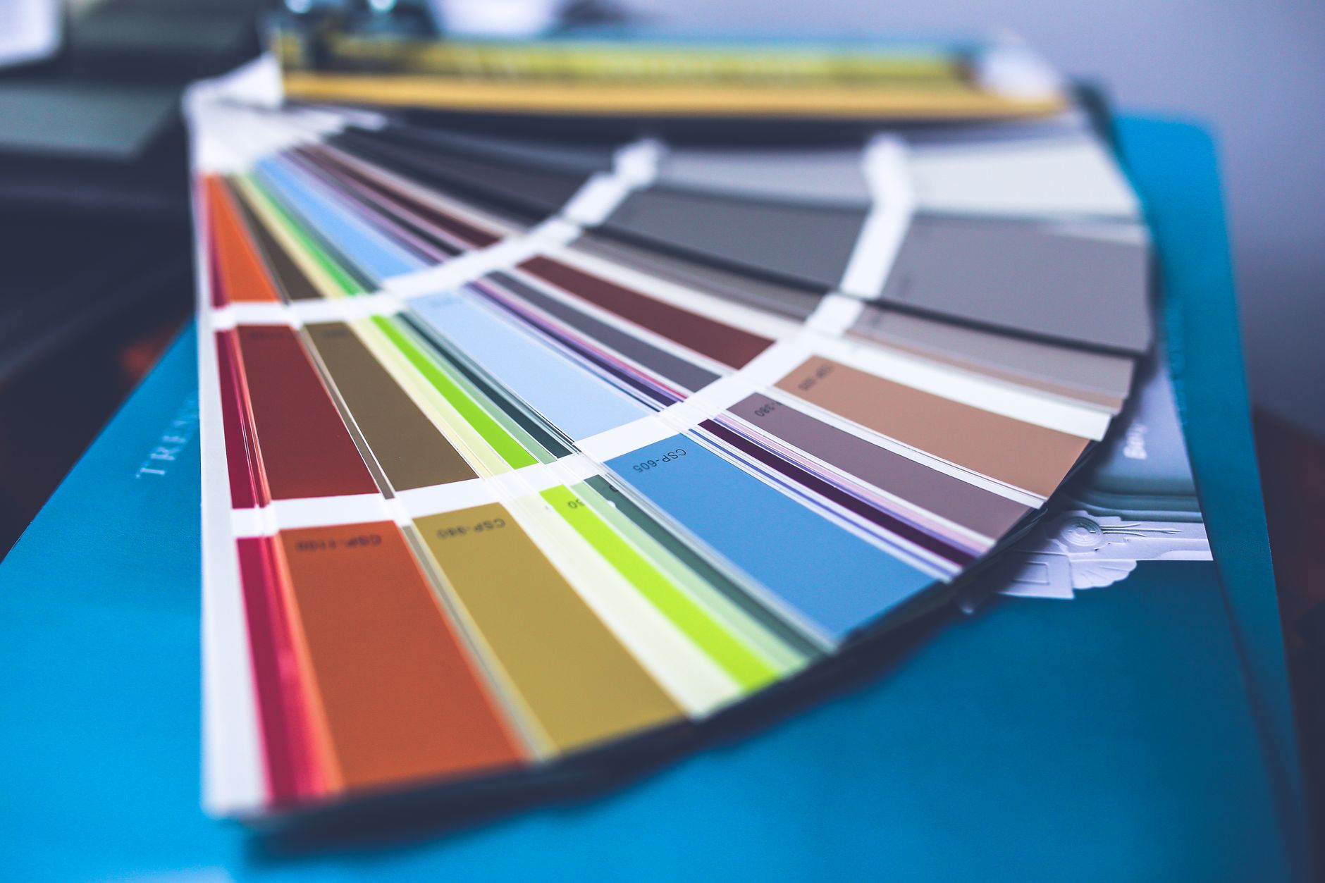
- Color & Palette: Our Solarized System — our palette and how we derive it from Solarized: warm low-glare surfaces instead of pure white, light and dark as deliberate mirror images, and accents dialed down so a call-to-action reads as calm rather than glaring. Tuned for reading comfort over long stretches, not for maximum contrast in a screenshot.
- Accessible Typography — the eight reading fonts and four text sizes in the Aa panel, what each one is for, and the honest caveat about what the research does and doesn’t support. No magic font; hand the reader the control.
- Zoom and Reflow — what actually happens to our pages at 400% zoom, measured rather than assumed. Prose passes clean; code blocks failed until we fixed them; third-party embeds silently clip. Includes the trap that nearly made us publish a wrong number: measure what the reader can do, not what the document reports.
- Form Accessibility — the minimum standard for any form we publish, from purpose statements through error handling to naming the system of power a form belongs to. A form is a door, and a door either opens on a bad day or it doesn’t.
- Lily Pads — our signature grouping pattern, and the Memory Craft argument underneath it: one idea per pad, six decorative tints that mean nothing on purpose, and a page built so that stopping halfway is a valid way to read it.
- Rhythm and Pause Points — vertical space as the material we pace with, learned from manhwa and webtoons: the gutter is where the reader does the work, and a page expresses time through space. Includes the numbers — a heading every five screens, twenty headings maximum, a spacer before each one.
- Designing for Memory — memory as a property of the environment rather than a talent readers are expected to have. What we take from Lynne Kelly’s Memory Craft, what we deliberately don’t, and why a page built for graceful re-entry beats one built for perfect recall.
- Designing for Motion — motion as a threshold that moves rather than a rule that holds, and the distinction that resolves it: who holds the throttle. Reader-driven scrolling regulates; site-driven animation harms. Includes the audit that found eighty animated blocks we did not know we had, none of them honoring the reader’s motion setting.
- Controls That Defer — the three-question test that separates a control which starts from the reader’s own settings from a layer that paints over them. Includes the question most people skip: ask what your control does when it is broken, not when it works.
- Designing for Paper — the broadsides, drawn in the medium they are actually for instead of being rescued into it afterwards. Why the sheets are white when the site is cream, the Solarized palette darkened until it survives as ink, and the four things that break when a self-contained sheet meets a WordPress page. Includes the number that settles the palette question: our own primary is a calm call-to-action on a cream screen and 2.2:1 on white paper, which is not a colour you can print words in.
- Writing Alt Text — the minimum standard for every image we publish, and the count of our own images that produced it. Why the decorative default is applied far too widely, and why the rule is front-load it rather than keep it short — a screen reader user decides on the first few syllables. Includes the audit: 2,594 images, 822 carrying empty alt text, and only 18 where empty was the right answer. Alt text quality tracked attention per image, not knowledge.