
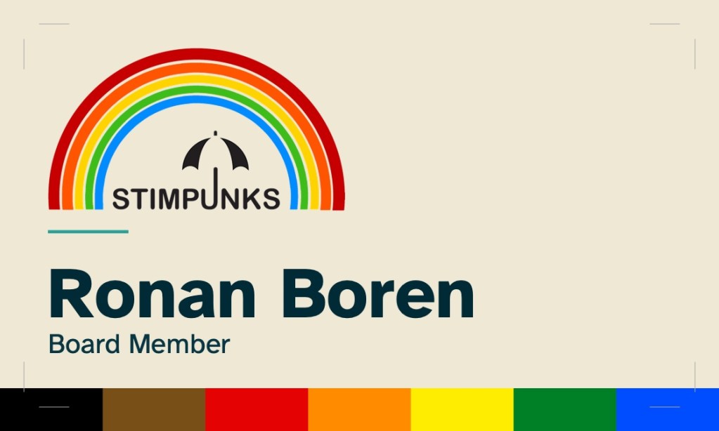
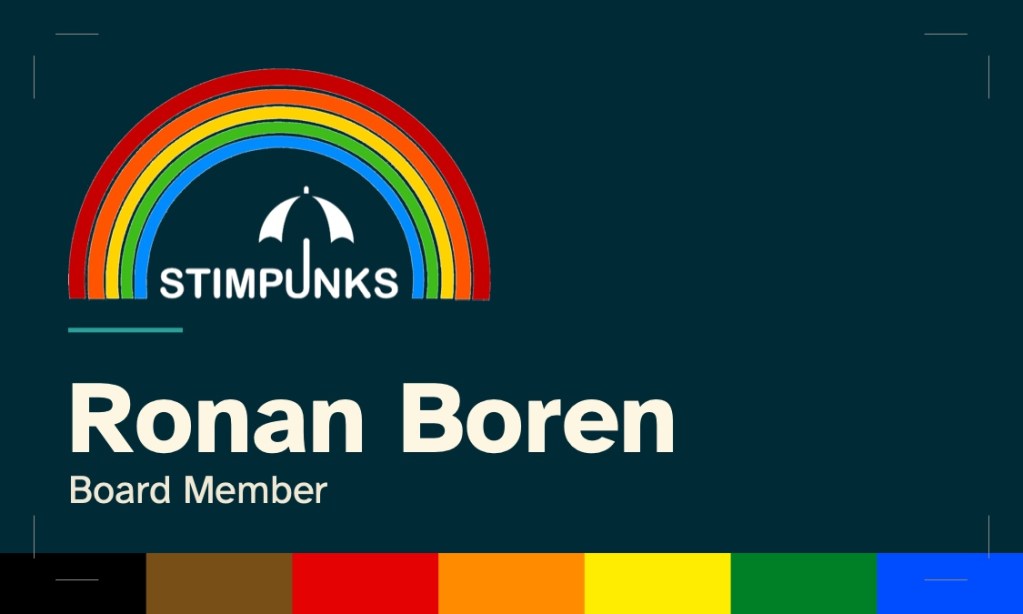
Standard design: Rainbow with Philly Pride bar — available in Light and Dark modes
—
Overview
Stimpunks Foundation staff business cards use a single standardized design — Rainbow with Philly Pride bar — available in two color modes: Light and Dark.
Both modes are offered because our community has diverse accessibility needs and personal preferences. Some people find light backgrounds easier to read; others find dark backgrounds reduce eye strain, improve focus, or better accommodate conditions like light sensitivity, migraines, or certain visual impairments. Offering both modes is a direct expression of our neurodiversity-affirming values: there is no single correct way to experience information.
Every design decision connects to the organization’s mission — neurodiversity-affirming, disability justice-centered, accessible by design.
Each card is print-ready, supplied as a two-page PDF (page 1 = front, page 2 = back) with bleed and crop marks. Only the name, job title, and email change between staff members.
—
Design Decisions
Typography: Atkinson Hyperlegible
All type is set in Atkinson Hyperlegible, a typeface designed by the Braille Institute specifically for readers with low vision or dyslexia. Its character design prioritizes disambiguation — letters that are easily confused (l/I/1, O/0, rn/m) are drawn with exaggerated differentiators.
Using Atkinson Hyperlegible on the card embodies the principle that accessibility benefits everyone. It is a legible, professional typeface engineered for people who need it most. The font is licensed free for personal and commercial use, and is fully embedded in all PDFs.
—
Color: Solarized palette
All colors are drawn from Solarized, a precision color scheme designed by Ethan Schoonover with calibrated CIELAB lightness relationships. Solarized is notable for its intentional dual-mode design — the same palette works in both light and dark contexts, with the monotone ramp simply inverted. This makes it a natural fit for a card family that needs to be coherent across both modes.
The light and dark modes are exact mirrors of each other: what BASE03 does in light mode (darkest text on lightest background), BASE3 does in dark mode (lightest text on darkest background).
Light mode
| Token | Hex | Usage |
|---|---|---|
| BASE2 | #eee8d5 | Card front background |
| BASE3 | #fdf6e3 | Card back background — warmest Solarized cream |
| BASE03 | #002b36 | Name — 12.25:1 contrast (AAA) |
| BASE02 | #073642 | Job title, org label, icons — 10.61:1 (AAA) |
| BASE01 | #586e75 | Contact text, caption — 4.99:1 (AA) |
| CYAN | #2aa198 | Decorative rule on front face only |
Dark mode
| Token | Hex | Usage |
|---|---|---|
| BASE03 | #002b36 | Card front background |
| BASE02 | #073642 | Card back background |
| BASE3 | #fdf6e3 | Name — 13.92:1 contrast (AAA) |
| BASE2 | #eee8d5 | Job title, org label, icons — 12.25:1 (AAA) |
| BASE1 | #93a1a1 | Contact text, caption — 4.86:1 (AA) |
| CYAN | #2aa198 | Decorative rule on front face only |
Note: Solarized’s accent colors (CYAN, BLUE, etc.) are intentionally low-contrast against both light and dark backgrounds — they are designed for syntax highlighting, not body text. All text uses the monotone ramp to achieve passing WCAG contrast. CYAN appears only as a decorative rule, which is exempt from contrast requirements.
—
Logo: Rainbow umbrella
The card uses the “Stimpunks Under the Rainbow” logo — the umbrella and wordmark framed within a rainbow arc.
In light mode, the logo is reproduced in full color with the original near-black umbrella and wordmark against the warm cream background.
In dark mode, the near-black umbrella and wordmark are reversed to white, while the rainbow arc colors remain unchanged. This preserves the logo’s character while ensuring legibility against the dark background.
The rainbow version of our Logo is by Betsy Selvam. The umbrella with word mark is by Becky Hicks. Both designers are Stimpunks board members.
—
Philly Pride Flag Accent Bar
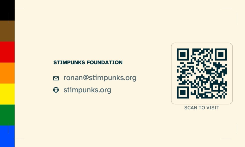
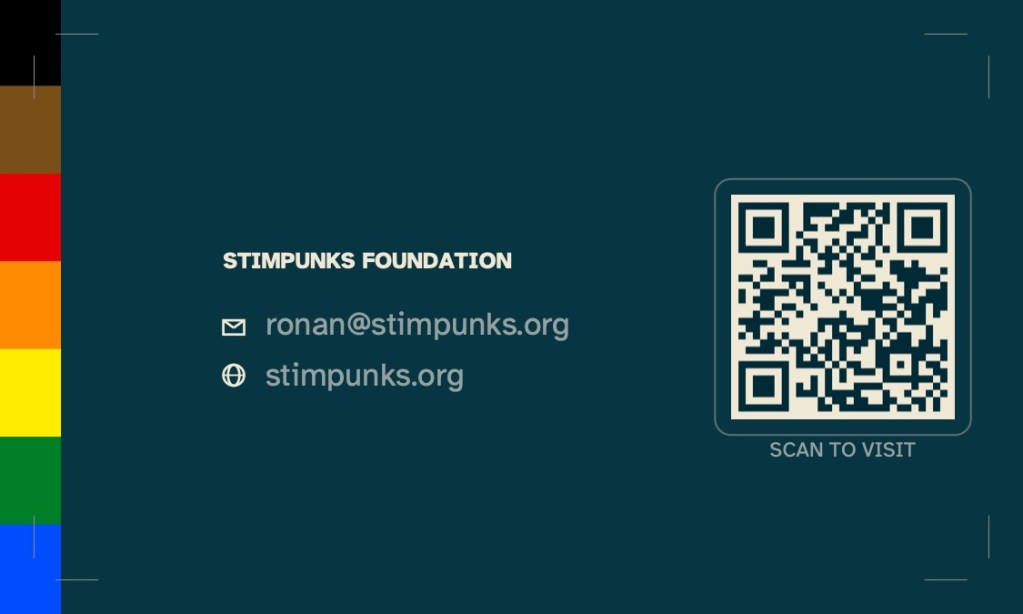
The bottom edge of the front face and the left edge of the back face carry a Philadelphia Pride flag accent bar. This element is identical in both modes.
The standard six-stripe rainbow flag represents LGBTQ+ pride broadly. The Philly Pride flag, introduced in 2017, explicitly centers people of color by adding black and brown stripes. Its inclusion makes an intentional statement: Stimpunks’ disability justice framework recognizes that neurodivergent and disabled people are not a monolith, and that racial justice and disability justice are inseparable.
The seven stripes run in order: black, brown, red, orange, yellow, green, blue. On the front face they run left to right along the bottom edge, echoing the rainbow arc of the logo above. On the back face they run top to bottom along the left edge.
—
QR Code
The back of every card includes a QR code linking to stimpunks.org. This is an accessibility affordance as much as a convenience — it removes the need to manually transcribe a URL, which benefits people with dyslexia, motor differences, or low vision.
The QR code uses error correction level H (30%), meaning it remains scannable even if up to 30% of the code is obscured, worn, or damaged.
In light mode the QR code is rendered in BASE03 on BASE3 cream. In dark mode it is rendered in BASE03 on BASE2, maintaining strong contrast in both cases.
—
Visual Hierarchy and Contrast
The front face establishes a clear three-level hierarchy, identical across both modes:
- Logo — top left, largest visual element
- Name — largest text, bottom left (27pt bold, AAA contrast on all backgrounds)
- Job title — smaller text, immediately below name (AA contrast on all backgrounds)
A short CYAN rule separates the logo zone from the name/title zone.
The back face uses two spatial zones: a left column for org label and contact info, and a right column for the QR code. The text block is horizontally centred in the available space between the sidebar and QR code, and vertically aligned to the QR code’s centre.
—
Contrast Verification
All text elements verified against WCAG 2.1. Decorative elements (accent bars, rule) are exempt.
Light mode
| Element | Colors | Ratio | WCAG |
|---|---|---|---|
| Name (27pt bold) | BASE03 on BASE2 | 12.25:1 | AAA |
| Job title (10.5pt) | BASE02 on BASE2 | 10.61:1 | AAA |
| “STIMPUNKS FOUNDATION” (6pt bold) | BASE02 on BASE3 | 12.05:1 | AAA |
| Contact text (8.5pt) | BASE01 on BASE3 | 4.99:1 | AA |
| Icons | BASE02 on BASE3 | 12.05:1 | AAA |
| “SCAN TO VISIT” (5.5pt) | BASE01 on BASE3 | 4.99:1 | AA |
Dark mode
| Element | Colors | Ratio | WCAG |
|---|---|---|---|
| Name (27pt bold) | BASE3 on BASE03 | 13.92:1 | AAA |
| Job title (10.5pt) | BASE2 on BASE03 | 12.25:1 | AAA |
| “STIMPUNKS FOUNDATION” (6pt bold) | BASE2 on BASE02 | 10.61:1 | AAA |
| Contact text (8.5pt) | BASE1 on BASE02 | 4.86:1 | AA |
| Icons | BASE2 on BASE02 | 10.61:1 | AAA |
| “SCAN TO VISIT” (5.5pt) | BASE1 on BASE02 | 4.86:1 | AA |
—
Print Specifications
These specifications apply to both modes.
| Spec | Value |
|---|---|
| Finished card size | 3.5″ × 2″ (standard US business card) |
| Bleed | 0.125″ (3.175mm) on all four sides |
| Total PDF page size | 3.75″ × 2.25″ |
| Safe zone | 0.125″ inside trim — all text and logo sit within this zone |
| Crop marks | Hairline marks at all four trim corners |
| Pages per file | 2 (page 1 = front, page 2 = back) |
| Fonts | Embedded — Atkinson Hyperlegible Regular and Bold |
| Color mode | RGB (convert to CMYK if required by printer) |
Files are compatible with commercial printers including Moo, Vistaprint, and local print shops. If your printer requires CMYK, ask them to convert or request a CMYK version.
—
Producing a New Card
To produce a card for a new staff member, only three values change:
- Name — replaces the current name
- Job title — replaces the current title
- E-mail — email address replaces the current address
Everything else — logo, colors, accent bar, QR code, layout, fonts, print specs — remains identical across all staff cards. Produce both light and dark mode versions for each staff member so they can choose the one that works best for them and the card recipient in the moment.
🎨 Brand: Business Cards
Ronan Boren’s business cards are the first in a standardized set for Stimpunks staff. The standard design is Rainbow with Philly Pride bar, produced in both light and dark modes for every staff member. Since our community has diverse accessibility needs and personal preferences, and since there is no single correct way to experience information, staff members will receive both dark and light mode cards to distribute according to the recipient’s preference.
Every design decision traces back to mission:
- Atkinson Hyperlegible — designed by the Braille Institute for low vision and dyslexic readers. Accessibility built in, not bolted on.
- Solarized — a precision color palette with calibrated CIELAB lightness relationships, chosen for its intentional dual-mode design. Light mode uses BASE2/BASE3 warm creams; dark mode uses BASE03/BASE02 deep teals. The monotone ramp is simply inverted between modes, keeping the palette coherent across both.
- Philly Pride flag accent bar — black, brown, red, orange, yellow, green, blue. The Philly flag’s black and brown stripes explicitly center people of color within LGBTQ+ pride. Racial justice and disability justice are inseparable.
- Rainbow umbrella logo — full color in light mode; umbrella and wordmark reversed to white in dark mode while the rainbow arc colors remain unchanged.
- QR code (error correction level H) — links to stimpunks.org. Removes the need to manually transcribe a URL, which benefits people with dyslexia, motor differences, or low vision.
- All text WCAG AA or AAA — every element contrast-verified. The card functions as a small manifesto.
Print specs: 3.5″ × 2″ finished, 0.125″ bleed all sides, crop marks, Atkinson Hyperlegible embedded, RGB color, 2 pages per file (front + back).
Raw changelog
- Published business card design rationale at stimpunks.org/about/brand/business-card/
- Standardized on Rainbow with Philly Pride bar as the Stimpunks staff business card design
- Produced light and dark mode variants for Ronan Boren (Board Member)
- Light mode: Solarized BASE2/BASE3 cream backgrounds, BASE03/BASE02/BASE01 text, CYAN decorative rule
- Dark mode: Solarized BASE03/BASE02 dark backgrounds, BASE3/BASE2/BASE1 text, CYAN decorative rule — exact mirror of light mode
- All text passes WCAG AA minimum; name and most elements pass AAA
- Philly Pride flag (7 stripes: black, brown, red, orange, yellow, green, blue) runs as horizontal bar on front, vertical bar on back
- QR code links to stimpunks.org, error correction level H (30%)
- Font: Atkinson Hyperlegible Regular and Bold, embedded in all PDFs
- Print specs: 3.5″ × 2″ finished, 0.125″ bleed, crop marks, RGB
- Dark mode logo processing: near-black marks (max channel \< 80) reversed to white; rainbow colors unchanged
- Wrote alt text for all four card faces (light front, light back, dark front, dark back)
PDF Files
Stimpunks Foundation — stimpunks.org