Does Playpen Sans capture the accessibility benefits of Comic Sans? If so, this feels like the casual handwriting font we’ve been needing.
It combines “the aesthetic form of something made by hand and the digital function of a professional typeface.”
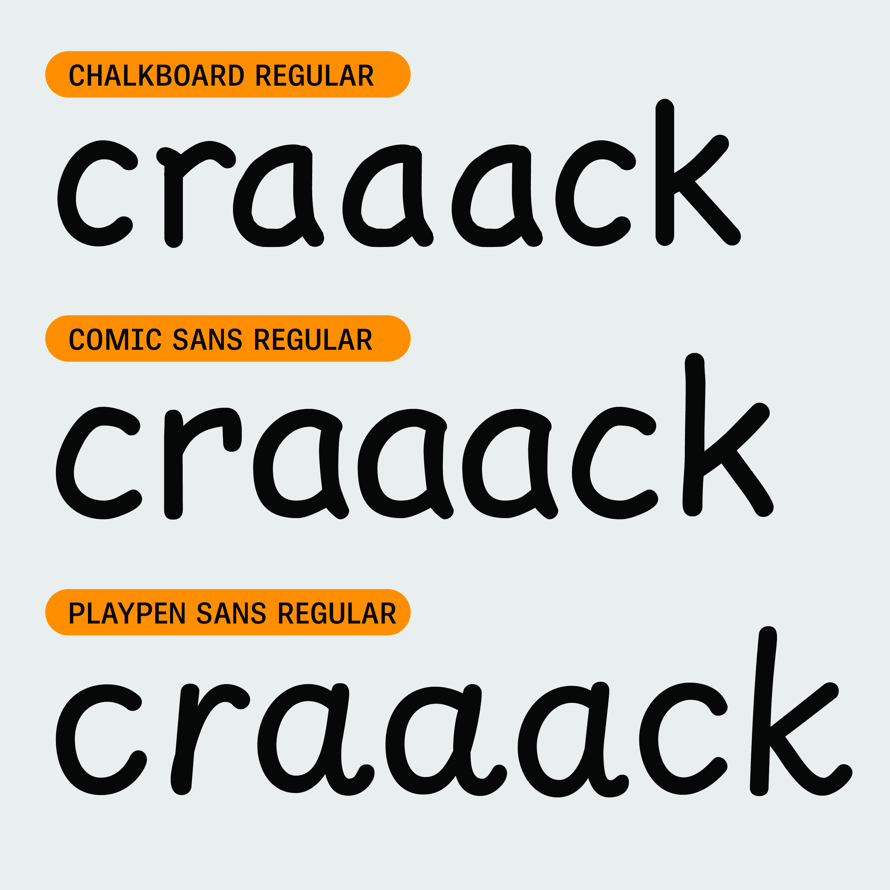
The Playpen Sans font family by Veronika Burian, Laura Meseguer, and José Scaglione, excels at imitating casual handwriting with a completely natural look — the aesthetic form of something made by hand and the digital function of a professional typeface.
Playpen Sans Font | Try, Buy and Download | TypeTogether
I’m hyperlexic and incompatible with most handwriting fonts. They don’t work for me anywhere as well as my favorite font, Montserrat, which feels like hyperlexia fuel.
Playpen Sans is compatible with me. It doesn’t slow me down like most handwriting fonts. It is “casual in look and digital in nature”, and that works for me.
That there are seven versions of each character and shuffler to avoid close repeats seems potentially compatible with dyslexia.
The goal of a typeface that is both casual in look and digital in nature is to appear authentically human within the bounds of digital reproduction. So a typeface with a set of characters that are “the same but different” has the authenticity everyone craves. The main problem with casual fonts is not having enough alternate characters to look real. And when a family has more than one alternate, another problem arises in controlling how and when a character gets replaced.
To solve these problems, we designed Playpen Sans with seven versions of each character. We also created a built-in shuffler so no single shape is repeated in close proximity. The result is text with spontaneous inconsistencies that feel fun and organic… all the benefits of a modern, pro typeface that looks natural.
Playpen Sans Font | Try, Buy and Download | TypeTogether
I’m very curious what dyslexic and hyperlexic people think about this font. Feedback welcome.
For you font geeks, “Making Playpen Sans | TypeTogether” is fascinating.

Leave a Reply