
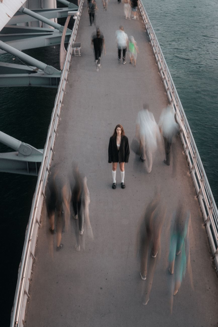
Motion is not one thing, and it is not uniformly bad. It is a threshold, and the threshold moves.
We know that because the same person on this team gets vertigo from parallax scrolling and also scrolls this front page up and down for an hour to regulate. Both are true. Any rule about motion that cannot hold both of those at once is the wrong rule.
The rule that holds both is this: the reader holds the throttle.
Two true things
Finding a theme for a client site was, once, a vertigo-inducing challenge. Parallax scrolling and transition animations were everywhere, and they still are. Modern web design trends make one of us literally sick to the stomach — vestibular assault, presbyopic eye strain, garbled screen readers. The transitioning text in those themes also threw off Speak Screen on iPhone, which means the motion was not only nauseating, it was breaking ear-reading at the same time.
And also:
When I’m dysregulated, I scroll our front page to help regulate. Up and down, over and over, listening and watching as I go. I added several songs to the front page to change up the journey. I also added more transition animations. I tend to use them sparingly, but I’m experimenting with the balance of scrollytelling techniques and vestibular thresholds. I’m very sensitive to parallax scrolling, but I can tolerate the animations I added.
That is stim-watching and stim-listening at page scale. Repetition, movement, and music are how a lot of us come down. Stimming is regulation, not noise, and a page you can move through can be a place to do it.
So we are not going to tell you that motion is an accessibility failure. Sometimes motion is the access.
Motion is a threshold, not a rule
Our page on Sensory Fluid says this about clothing, and the physiology is the same for screens:
Touch tolerance fluctuates. A necklace that feels delightful when well-rested can feel unbearable when the central nervous system is already saturated with input it can’t process. That’s not inconsistency. That’s physiology.
Motion tolerance fluctuates the same way. The animation that is soothing on a rested Tuesday is unbearable on a migraine Thursday. It varies between people by an enormous margin, and it varies within one person across a single week.
A threshold that moves cannot be set by us. It belongs to the reader.
That is the same conclusion we reached about reading fonts — there is no single font that works for everyone, so hand the reader the control. Motion is that argument again, with higher stakes, because getting it wrong makes someone ill rather than merely uncomfortable.
Who is holding the throttle
The contradiction resolves once you ask who is driving.
Scrolling is reader-driven. You set the speed. You change direction. You stop. You go back up and do it again because the going up and down is the point. Every property of that motion is yours, moment to moment, and it costs nothing to abandon. This is the motion that regulates.
Animation, autoplay, parallax, and carousels are site-driven. We set the speed. We decide it happens. You arrived to read something and got movement you did not ask for, at a rate you cannot change, tied to a scroll you were using for something else. This is the motion that harms.
The difference is not how much the pixels move. It is who decided.
So our long, media-rich, scroll-as-journey pages are not in tension with our refusal of animation. They are the same commitment. We build a place worth moving through, and then we get our hands off the controls.
What we found when we counted
We sat down to write this page believing there was one animation left on this website — a white rabbit at the bottom, a small piece of playfulness we had deliberately kept.
Then we counted.
Eighty animated blocks, across forty-one pages. Four of them were the rabbit. The other seventy-six were animating quotations, song lyrics, photographs, video embeds, testimonials, and — on two pages — a button asking people to crowdfund a member of our community.
None of them honored prefers-reduced-motion. Our animation plugin has no reduced-motion handling at all, so every reader who had asked their operating system for less movement was getting eighty slide-ins and fades from us anyway. We had been telling people, on another page of this same Field Guide, that we respect that setting. We were wrong, and we had been wrong for years.
It gets worse, and the worse part is the part worth learning from.
The plugin hides every animated block by default — opacity: 0 — and relies on its own JavaScript to reveal it. That is a reasonable-sounding way to build a fade-in and a terrible way to fail. When the script does not run, the animation does not gracefully not-happen. The content stays hidden. We watched it happen: a clean page load where the crowdfunding button, the photographs, and the pull quotes simply were not there.
We do not know how many readers ever hit that. We do know that some of these animations had quietly stopped working across WordPress upgrades, and nobody noticed, because a thing that does not appear looks exactly like a thing that was never there. That is a failure with no symptom on our end.
So: eighty blocks of decorative motion, invisible to us, ignoring the reader’s stated preference, and capable of taking the content down with them.
We turned it off.
What we do
We respect prefers-reduced-motion. It is the signal a reader already set at the operating-system level, on their own machine, for every site they visit. Honoring it is the whole of our philosophy in one media query: a control that defers to what the visitor already chose, never a layer that overrides it. This is why we refuse accessibility overlays, and it is the same rule that governs our theme, font, and text-size controls.
No parallax. Ever. It is the single worst offender for vestibular distress, it buys nothing a reader wants, and there is no version of it that is worth the cost. This is not a preference we might revisit.
No autoplay, no carousels, no infinite marquees. Nothing moves on this site because time passed. Movement happens because you scrolled, or because you pressed play.
Motion never carries meaning by itself. If something has to move for the page to make sense, the page is broken. This is the same rule we apply to lily pad tints — decorative on purpose, so that nothing is lost when the decoration is gone.
Decoration must never be load-bearing. No effect gets to hide content while it waits for permission to reveal it. If the JavaScript never arrives, the reader still gets the words. Animation is allowed to add; it is not allowed to subtract.
Motion must not break the readers who are listening. Animated and transitioning text confuses text-to-speech. Anything that moves gets checked against ear-reading, not only against the eye.
Count it. This is the rule we did not have, and the reason for everything above. Motion arrives one reasonable decision at a time and is never visible as a total until somebody adds it up. “Sparingly” is not a number. Eighty is a number. A practice you cannot count is a practice you are not actually running.
The external standard we hold ourselves to is the Website Specification’s reduced-motion entry, which is marked required rather than recommended, and which is blunt about the stakes: decorative animation, parallax, and autoplay can trigger vestibular distress, migraines, and seizures. WCAG 2.2.2 Pause, Stop, Hide is the floor — anything moving for more than five seconds needs a way to stop it.
What we do not do
We do not sterilise the site.
Turning off eighty animations is not the same as deciding that stillness is access. It would be easy to read this page as motion bad, remove motion, and that is not what happened here. What we removed was site-driven motion that the reader never asked for, could not stop, and in some cases was silently losing content to.
What we kept is the part that was doing the work all along: a long front page, community art, music, and a scroll that is deliberately a journey. None of that required us to animate anything. The journey survived the audit completely intact, because the journey was never made of animation. It was made of having somewhere worth going.
Our House Style Guide tells us to avoid framing that pits access needs against each other. We expected this audit to force exactly that trade — the motion-sensitive reader against the reader who stim-scrolls. It did not. The conflict was mostly imaginary, and it dissolved the moment we asked who is driving instead of how much is moving.
The resolution is never less motion for everyone. It is motion the reader controls.
Where you can see it
Scrollytelling is where this gets tested hardest — a form built entirely around scroll, written for readers who scroll slowly, stop, and come back. Its promise that “pace is part of accessibility” only holds because the pace is yours.
Designing for Memory is the same argument from the other side. We decline Memory Craft‘s maximalism — the loud, the grotesque, the startling — because a loud page is not memorable, it is unusable. A page that will not hold still is loud in a different register.
Where this stands
We are writing this down partly to hold ourselves to it.
Done. All plugin animation is switched off site-wide in Additional CSS — no movement, and no content hidden behind a script that may not arrive. The rule neutralises any animated block on the site, including ones added later, so the reduced-motion failure is closed rather than pending.
In progress. The animation settings are still attached to eighty blocks across forty-one pages. They do nothing now. They are being cleared page by page as we get to them, and when the last one is gone the CSS rule goes too. Nothing depends on that finishing.
If you hit motion on this site that hurts, tell us. That is not a bug report we will file politely and forget. It is the only instrument we have for a threshold we cannot see.