
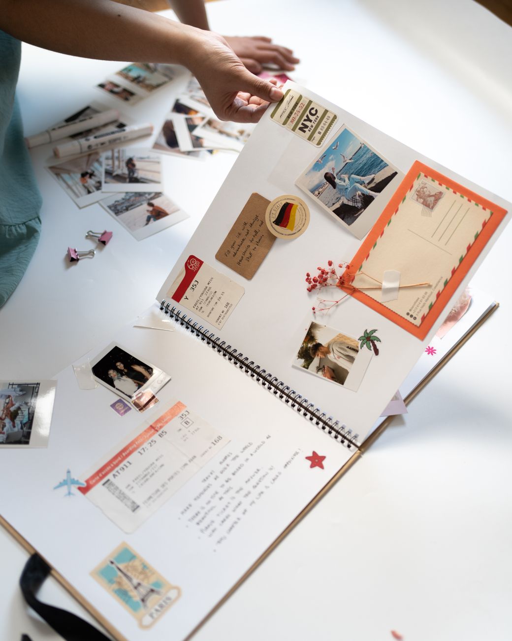
We treat memory as something you design for, not something a reader is expected to perform on demand.
That idea comes from Lynne Kelly’s Memory Craft, a book about the memory techniques of Indigenous and medieval cultures and what neuroscience now says about why they work. Its argument is that memory is not a talent some people have. It is a property of an environment, and environments can be built well or badly.
A page is an environment.
If you want to remember what you’ve written down then take the lessons offered in the medieval manuscripts and turn your page into a memory space.
— Lynne Kelly, Memory Craft
What we take from it
Chunk it, and keep the chunks small
To memorise any information, you need to first organise it into little chunks that flow in a logical order.
Medieval memory pages were ruled into small rectangles, and Kelly notes that each held no more than five items — the maximum suggested for a single location. That is a design specification from the fifteenth century, and it is roughly the size of a well-made lily pad.
A page of neat and tidy typed text in long paragraphs is the least memorable format known. You need to reduce it into small segments, each made memorable by flourishes and fancy layouts.
Short sentences are a memory aid, not a style preference
I have found that students who read an entire paragraph of information quickly will often claim they didn’t understand it, but if they read it phrase by phrase, stopping at each comma or full stop to ensure they understand, the entire paragraph becomes meaningful. With short sentences, you are forced to engage with each element of the information and not try to grasp the whole in a single befuddling quest.
This is the same rule our House Style Guide asks for — one idea per sentence, often one per line — arrived at from a completely different direction.
Place is how memory works
The neuroscience explains how we benefit from repetition and music, and in particular the value of memory palaces.
Associating memory with place is, Kelly argues, hardwired — which is why cultures with no contact developed the same techniques. On a website, place means a page you can recognise on return: consistent patterns, distinct spaces, sections that behave like rooms rather than paragraphs in a queue.
Distinctness beats neatness
The big lesson of this chapter is: don’t make nice neat notes.
A uniform page is an unmemorable page. Something has to make one part of it different from another — colour, grouping, a change of shape.
How we apply it
We externalize memory. We repeat key ideas across pages in different forms, summarize and re-introduce concepts, and build pages you can drop into, leave, and come back to. The site carries memory with you.
We use place and pattern. Content is organized into distinct spaces — field guides, encyclopedias, pathways, timelines — with consistent visual patterns and headings. Sections are rooms you can recognise, not a linear textbook. You don’t have to remember where you are; you just have to recognise it.
We build in orientation cues. Pages are written to answer Where am I? What is this for? What can I do next? Intros, taglines, one-line summaries, and section headers act as memory anchors, especially for readers navigating fatigue, stress, or overload.
We respect forgetting. Forgetting is not failure. Memory fluctuates, attention comes and goes, context gets lost. So we design for graceful re-entry, not perfect recall.
We favour tools over willpower. Instead of telling people to try harder: checklists, templates, patterns, chunked information, and multiple paths through the same ideas. Systems matter more than effort.
Where you can see it
Lily pads are the most direct application — self-contained blocks that give ideas places to land and hold memory between visits. The tables of contents and heading hierarchy on every long page are the wayfinding half. The reading controls exist so a page still works on a return visit under different conditions than the first one.
What we don’t take from it
Memory Craft is maximalist, and we are not. Kelly’s advice runs to the wild, the grotesque, the vulgar, the erotic — the more startling the image, the better it sticks. Decorate everything. Doodle all over it. Add colour until the page is loud.
That works, and it is the wrong advice for us.
Kelly is writing about personal memory work: your notebook, your memory palace, images built by you and seen by nobody else. We are building a public site read by people with sensory sensitivities, migraine, and overload — where a loud page is not memorable, it is unusable. Our palette goes the other way on purpose: warm, low-glare, tuned for comfort over an hour rather than impact in a second.
So we take the structural lessons — chunk it, place it, make it distinct, keep sentences short, let people re-enter — and decline the maximalist ones. Distinctness does not require volume. A pale tint and a rounded corner make a block distinct just as reliably as a grotesque marginal drawing, and one of them can be read on a bad day.
Memory thrives when the environment supports it. We build pages that remember with you, not against you.