
The Flyer
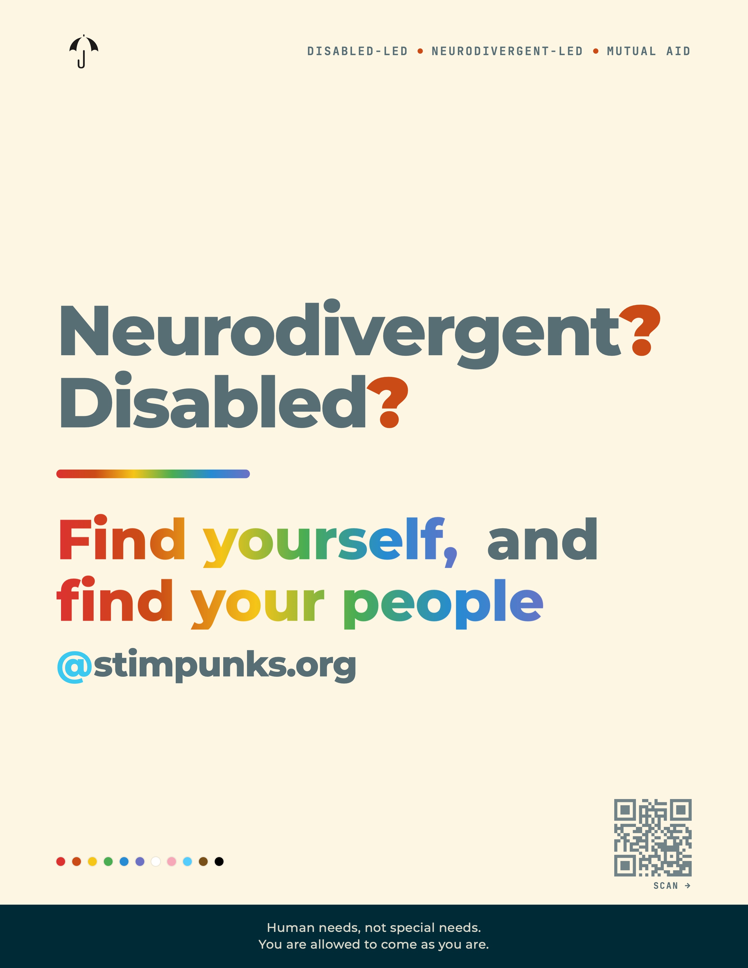
A two-sided letter-size flyer built around five lines of text:
Neurodivergent?
Disabled?
Find yourself, and
Find your people
@ stimpunks.org
The front poses the two questions in heavy display type with rainbow-orange question marks, then answers them in a rainbow-gradient hand: find yourself, find your people, @stimpunks.org. A horizontal rainbow rule acts as the hinge between question and answer. A row of eleven Progress Pride dots — six rainbow stripes plus the trans white/pink/light-blue plus the BIPOC brown/black — sits in the bottom margin as a quiet flag-of-belonging. The deep teal footer band carries a two-line promise:
Human needs, not special needs.
You are allowed to come as you are.
The back carries the argument the front gestures at. A Community as home eyebrow leads into a per-word rainbow headline — Until you / find your people. — followed by the Cadence quote that started the philosophy page, with the closing phrase until you find your people set in rainbow stress. Two pull definitions ground the language: Chosen family (nonbiological kinship bonds, deliberately chosen for the purpose of mutual support and love) and It takes a whānau (the Autistic translation of it takes a village). The page ends with the full URL @stimpunks.org/philosophy/find-your-people and a QR code pointing to the same page.


Find Your People
The flyer is a print artifact of a long-running piece of Stimpunks philosophy. The argument has three threads.
You are not alone. Many neurodivergent and disabled people grow up feeling like aliens in their own families and schools. The first time they meet other people who share their wiring is often the first time they feel at home. Cadence, writing for the Disability Visibility Project’s Community as Home portrait series, put it as well as anyone has:
When I found the autistic community, it was like finally coming home after 23 long years at sea. Often you don’t realize how lonely and frightened you’ve been the whole time, until you find your people.
That sentence is the seed the whole flyer grows from.
Niches matter. Steve Silberman’s NeuroTribes documented how the early Autistic internet — ANI-L in 1994, InLv in 1996 — became “a specialized ecological niche, an incubator for Autistic culture.” Harvey Blume, the journalist who first picked up the story, predicted that the impact of the internet on Autistic people might one day be compared to the spread of sign language among the Deaf. The pattern repeats wherever neurodivergent people have access to one another: niche communities, built from the ground up, both out of necessity and because our interests and modes of being are, well, weird.
Whānau, not village. The English idiom is it takes a village to raise a child. The Autistic translation, drawn from the Te Reo Māori concept of whānau by way of Autistic Collaboration, is sharper: for an Autistic person it takes an Autistic whānau to feel loved and alive. Whānau is more than family. It’s a soul tribe — a human-scale ecology of care, bonded through shared experience and working together. Most Autistic people are not born into healthy Autistic whānau. We have to co-create them, in our own space and time.
We use the word whānau here with gratitude and deep respect. Whānau is a living Te Reo Māori concept, rooted in Māori kinship, worldview, and ways of being — it belongs to Māori people and culture. We follow the lead of Autistic Collaboration in drawing on it carefully, and we do so with awareness that lifting Indigenous concepts out of their living cultural context — epistemic appropriation, borrowing knowledge and frameworks without acknowledgment of their origins or the people they belong to — is itself a form of harm. We are committed to honouring, not extracting. [Read more about how we engage with Indigenous knowledge.]
Chosen family. The LGBTQ+ community has a parallel name for the same phenomenon: chosen family — nonbiological kinship bonds, deliberately chosen for the purpose of mutual support and love. The term originated in queer gatherings like the Harlem Drag Balls of the late nineteenth century and is still load-bearing today, particularly for the heavy overlap between the Autistic and LGBTQ+ communities. The flyer carries both terms — chosen family and whānau — because they are the same answer in two languages.
The flyer is a one-page invitation to that answer. The front asks the question. The back names the feeling.
Accessibility Notes
This flyer was built with accessibility as a design constraint, not an afterthought.
Typeface. Body, display, and headline type is set in Montserrat, the brand’s house face — a geometric sans whose rounded forms match the STIMPUNKS wordmark. Atkinson Hyperlegible — designed by the Braille Institute specifically for low-vision readers — is retained as the next fallback in every text stack, so the design degrades to a legibility-optimised face if Montserrat fails to load. Mono labels (kicker, URL, eyebrow, QR caption, pull-definition labels) are set in JetBrains Mono.
Type size. No text on the flyer prints below 11pt. Headlines run from 64pt to 80pt at print size. The Cadence quote is set at 32pt. Pull-definition labels (CHOSEN FAMILY, IT TAKES A WHĀNAU) are 11pt monospace at full opacity — large enough and dense enough to clear WCAG AA.
Colour contrast. Text colours are drawn from the Solarized palette, chosen to maintain sufficient contrast against the cream background (#fdf6e3). Body and label text in slate (#586e75) achieves 5.8:1 against cream — passes WCAG AA for normal text and AAA for large text. The teal footer band (#002b36) reverses the same colour pair at 18:1.
No opacity tricks. Earlier drafts dimmed labels with opacity: 0.7 to soften the hierarchy. That dropped small labels under the 4.5:1 AA floor, so we removed all opacity dimming and lean on size, weight, and letter-spacing for hierarchy instead.
Colour palette. The rainbow rule and dot row use the full Progress Pride spectrum — six rainbow stripes plus the trans flag’s white/pink/light-blue plus the BIPOC brown/black — in solidarity with Black, Brown, and trans LGBTQ+ people. The same flag colours are used across all Stimpunks print materials.
No gradient text in print. PDF Expert and some other readers clip background-clip: text glyphs at the bounding box edge, cutting off descenders. The back-side headline and the rainbow stress phrase in the Cadence quote are set as per-word flat colours rather than a gradient mask, so the rainbow renders pixel-correctly in every PDF reader we’ve tested.
QR code. A QR code on the back links to https://stimpunks.org/philosophy/find-your-people/. The QR is rendered with mid error correction so it remains scannable when reproduced at small sizes or on uncoated stock.
The design rationale follows the same system as the Esmx bookmark and Stimpunks business cards.
Print Specifications
Finished Size US Letter, 8.5 × 11 in (216 × 279 mm), portrait
Substrate 100–120 lb (270–325 gsm) cover stock for handouts, or 80 lb (118 gsm) text stock for posting on bulletin boards. Matte or silk finish preferred. Avoid gloss — it dulls the cream background.
Colour CMYK process or digital print. Background is Solarized cream (#fdf6e3); footer band is Solarized base03 (#002b36). Both render reliably on consumer and commercial presses.
Bleed No bleed required — all elements respect a 64 px (≈ 17 mm) safe margin from the trim edge. The teal footer band runs to the trim; if your printer requires bleed, add 3 mm to the bottom edge.
Duplex Print front and back back-to-back. Flip on the short edge (portrait flip). The umbrella mark and kicker eyebrow align across both sides when printed correctly.
Files
| File | Page size | Sides | Notes |
|---|---|---|---|
find-your-people-flyer.pdf | 8.5 × 11 in | Front + back | Two-page duplex master |
find-your-people-flyer-front.pdf | 8.5 × 11 in | Front only | Simplex printing |
find-your-people-flyer-back.pdf | 8.5 × 11 in | Back only | Simplex printing |
find-your-people-flyer-bw.pdf | 8.5 × 11 in | Front + back | Mono fallback for low-cost printing |
Home/office printing All files print on any home printer. Use actual size (not “fit to page”) in your PDF viewer. The cream background prints reliably on white stock; for a stronger cream tone, print on natural or ivory paper instead.
Cutting None required at finished size. If reducing for a smaller format, scale uniformly — the layout was built at 850 × 1100 px and scaled to 8.5 × 11 in for print, so all proportions hold at any uniform reduction.
Typography
Display & body: Montserrat (variable weight 100–900, regular and italic), embedded in all PDFs. The brand’s house face across stimpunks.org.
Mono: JetBrains Mono (Regular 400, SemiBold 600), for labels, kicker, URL, and QR caption.
Fallback: Atkinson Hyperlegible is the next stack entry on every text element — a Braille Institute–designed legibility face kept in the stack as an accessibility-focused backup if Montserrat fails to load.
Front:
| Element | Weight | Size | Colour |
|---|---|---|---|
Question lines (Neurodivergent?, Disabled?) | Bold 800 | 80pt | BASE01 #586e75 |
| Question marks | Black 900 | 80pt | Rainbow orange #cb4b16 |
Answer lines (Find yourself, / find your people) | Bold 800 | 64pt | Rainbow gradient (per-word in print) |
@stimpunks.org line | Bold 800 | 40pt | BASE01, with cyan @ |
Kicker (Disabled-led • Neurodivergent-led • Mutual aid) | Mono 600 | 13pt | BASE01 #586e75 |
| Footer promise | Sans 500 | 14pt | BASE3 #fdf6e3 on BASE03 #002b36 |
Back:
| Element | Weight | Size | Colour |
|---|---|---|---|
COMMUNITY AS HOME eyebrow | Mono 600 | 13pt | BASE01 #586e75 |
Headline Until you / find your people. | Bold 800 | 76pt | Per-word rainbow stops |
| Cadence quote body | Display 500 | 32pt | BASE01 #586e75 |
Quote stress (until you find your people.) | Bold 800 | 32pt | Per-word rainbow stops |
Citation (— Cadence · Community as Home) | Mono 500 | 12pt | BASE01 #586e75 |
Pull labels (CHOSEN FAMILY, IT TAKES A WHĀNAU) | Mono 600 | 11pt | BASE01 #586e75 |
| Pull body | Display 600 | 19pt | BASE01 #586e75 |
URL line (@stimpunks.org/philosophy/find-your-people) | Bold 800 | 28pt | BASE01, with cyan @ |
QR caption (SCAN →) | Mono 600 | 10pt | BASE01 #586e75 |
Colour palette
All text colours drawn from the Solarized palette, matching the Stimpunks bookmark and business card systems.
Text — all pass WCAG AA (4.5:1) against #fdf6e3:
| Role | Solarized name | Hex | Contrast ratio |
|---|---|---|---|
| Body text / labels / headlines | BASE01 | #586e75 | 5.83:1 |
| Footer reverse text | BASE3 | #fdf6e3 on BASE03 | 18.35:1 |
@ mark accent | Stim sky | #268bd2 | 4.55:1 |
Decorative (non-text):
| Role | Hex | Notes |
|---|---|---|
| Background | #fdf6e3 | Solarized BASE3 (cream) |
| Footer band | #002b36 | Solarized BASE03 (deep teal) |
| Question-mark accent | #cb4b16 | Rainbow orange |
Per-word rainbow stops — Solarized accent colours, rotated by line:
| Stop | Hex | Solarized name |
|---|---|---|
| Red | #dc322f | red |
| Orange | #cb4b16 | orange |
| Yellow | #b58900 | yellow |
| Green | #4aad52 | green (custom) |
| Blue | #268bd2 | blue |
| Violet | #6c71c4 | violet |
Progress Pride dot row — eleven dots across the bottom margin:
#dc322f · #cb4b16 · #f5c518 · #4aad52 · #268bd2 · #6c71c4 · #ffffff · #f7a8b8 · #55cdfc · #784f17 · #000000
Assets
Source files, PDFs, and the web prototype are bundled together.
Web version A live, tweakable HTML prototype lives in the project repository at Find Yourself Find Your People.html. It exposes a Tweaks panel for live customisation: theme palette, question-mark colour, type sizes, kicker copy, promise copy, rainbow rule width and alignment, dot-row alignment, and QR toggles for both sides.
Print version A separate Find Yourself Find Your People-print.html carries the same design with print-specific adjustments — gradient text rendered as per-word flat colours to avoid PDF Expert clipping, slightly tighter answer-line sizing for renderer slack, and an auto-print script. Open it in any browser, choose Save as PDF, set page size to US Letter, and disable headers and footers.
This work is licensed under a Creative Commons Attribution-ShareAlike 4.0 International License.