Type is never neutral. Before the font menu, there was molten lead and spinning film — hot metal typesetting and cold light, and a whole secret language of slugs, mats, and leading. Join us to fall down the typesetting rabbit hole and infodump on the craft that made the printed word.
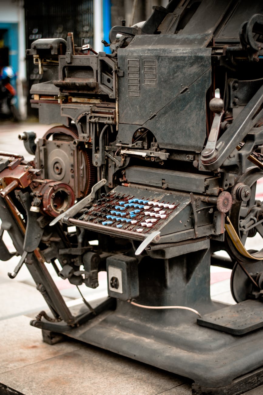
For most of the last century, turning written words into printed pages meant machinery most people never saw. The Linotype was a piano-sized contraption of brass matrices and molten lead that cast whole lines of type at once — a “line o’ type,” which is where the name came from. Then came phototypesetting, with no metal at all: light fired through a film negative of each letter, projected through a lens that sized it, exposed onto photographic paper, pulled through baths of chemicals, sliced apart with a razor blade, and waxed onto layout boards by hand. Two completely different ways of making the same thing. A page of text.
Both came wrapped in a vocabulary that sounds like a spell. Leading — the spacing between lines — is named for the actual strips of lead slotted between rows of metal type. Kerning. Em and en. Sorts and slugs and mats and galleys. Widows and orphans. Picas and points. A whole craft language, most of it invisible now, buried inside the font menu you click without thinking.
This is exactly the kind of bottomless, gloriously specific rabbit hole that Autistic and neurodivergent attention worlds were built for. You can spend an hour on the mechanics of a single machine and surface wanting more. And underneath the craft is something sharper: type is never neutral. The letterforms a culture chooses to speak in carry meaning the designer never intended and can’t take back.
We’re gathering for an Infodumplings show-and-tell about typesetting and phototypesetting. Bring the typeface you love. Bring the one you hate. Bring whatever you know about hot metal, cold light, paste-up, kerning, or the politics baked into a font. Tell us what you’ve fallen down the rabbit hole on. Ask what someone else knows.
We’ll watch a machine work, take a bodymind break, and open the room.
Come as you are. Bring the thing you can’t stop thinking about.
Videos
We’ll watch a machine actually run — the strange, mesmerizing mechanics of making type. Pick whichever pulls you in; we’ll screen-share one together and you can watch the other on your own time.
Phototypesetting with the Berthold ‹diatype› — YouTube
A Real, Working Linotype Machine — YouTube
Where to Start
The Phototypesetting entry on Wikipedia gives you the map: how cold type worked, why it replaced hot metal, and why it was itself made obsolete by the personal computer in barely four decades. Skim it before the session or during it — it’s a fast tour through machines almost no one alive has touched.
The Stimpunks Frame
Stimpunks is a neurodivergent- and disabled-led community built on a few bedrock beliefs. This one topic — how text gets made — touches all of them.
The Rabbit Hole Has No Bottom
Monotropism is the tendency to pour attention into a narrow channel and go deep. Typesetting rewards that exactly. There is always another layer: the difference between a slug and a sort, why “leading” is said like the metal and not the verb, how a Linotype operator read brass matrices dropping into place to cast a line, the decades-long arguments over a single typeface. The font menu hides all of it. Underneath every name in that dropdown is a machine, a foundry, a history, and an argument.
For a monotropic mind, that isn’t a chore. That’s the good stuff. The special interest that opens and opens, the flow of following one thread until the room disappears. This is what Infodumplings is for. We make space for the rabbit hole on purpose — the topic that never quite closes.
Hot Metal and Cold Light
Two machines, two eras, two completely different crafts. The Linotype (1884) cast lines of type from molten lead — hot metal, hot work, a skilled operator at a ninety-character keyboard feeding brass matrices that dropped, lined up, got cast, and were sorted back into place automatically. Phototypesetting (1949) threw the metal away: light through a film negative, a lens to size each letter, photographic paper, chemical baths, and a paste-up artist with a razor blade and hot wax assembling the page by hand.
Both were embodied skills. Knowledge that lived in hands, timing, and judgment — not in a manual. Both are essentially gone now. The Wikipedia entry even records the cost. Adrian Frutiger, who redrew dozens of typefaces to survive phototype, said the distortions he was forced to introduce left him with “misshapen sausages” instead of clean letters. Newer did not mean better. It meant different, with losses nobody bothered to log at the time.
This is bricolage at industrial scale — generations of people improvising with the materials and machines in front of them, making language physical. We keep crafts like this alive by doing exactly what we’re about to do: talking about them, out loud, with people who care.
Type Is Never Neutral
Here is where it gets sharp.
In 1923, the German designer Rudolf Koch carved a heavy, flared typeface called Neuland. He meant it as a modern blackletter — a “new black face” for religious broadsides, born out of his experience of the First World War. He had no say in what happened next. The moment it crossed the Atlantic, stripped of his intent and sold purely as attention-grabbing advertising type, Neuland — and later its near-twin, Lithos — drifted into a single use: a visual shorthand for “Africa,” “jungle,” “safari.” It landed on the covers of books about Black people, and on Jurassic Park, Tarzan, and Jumanji.
The designer and critic Rob Giampietro calls this stereotypography: the stereotyping of whole cultures through the typefaces forced to stand in for them. Koch’s intent did not matter. The purpose of the typeface became whatever it was used to do.
That’s the thing about tools. They are never just tools. The purpose of a system is what it does — not what it was meant to do, not what its maker hoped. A letterform can carry a century of someone else’s assumptions, and the person reading it never agreed to any of them. This is the same lens we bring to systems of power everywhere we find them, including the technologies being sold to us as neutral today.
Who Gets to Set the Type
For most of printing’s history, making your words public was gatekept — by cost, by metal, by the trained hands you had to hire. Phototypesetting cracked that open. By the 1970s, the cheaper machines made it economically possible for small publications to set their own type at professional quality. Desktop publishing finished the job. The means of making text moved into more hands.
That matters to us. Stimpunks runs on the belief that knowledge should be a commons — openly licensed, free to copy, remix, and carry forward. The history of typesetting is, among other things, the history of who got to be heard in print, and the slow, uneven widening of that circle. When you publish your own words today, you are standing on a hundred years of machines that used to say no.
Join Us
Infodumplings happens every Thursday at 7PM Central, online via Discord. No preparation needed. No expertise required. Come as you are. Our typesetting and phototypesetting session is on Thursday, June 4.
You can participate by video, voice, text chat, or just by being in the room. All modes are welcome.
Cameras optional. Chat-only participation fully valid. Stims, movement, and fidget tools encouraged. No one will be called on. Silence is participation. If you want to infodump about a typeface, infodump. If you’d rather drop links in text chat, do that. If you’d rather just listen while other people geek out about kerning, that is equally valid.
Join our community to get access, then find us in our online space. Our Infodumplings page describes what to expect.
How the Hour Goes
| Timestamp | Session |
|---|---|
| 0:00 | Welcome & Grounding — Brief framing: what typesetting is, why we’re here, what an infodump looks like. No wrong way to be in this space. |
| 0:05 | Watch Together — A short clip of a Linotype or the Berthold ‹diatype› actually running. Screen-shared, no talking over it. |
| 0:15 | Opening Infodump Round — Anyone who wants to share what they already knew, loved, or hated — no filter, no order. Favorite typeface? Worst font crime? The machine you can’t stop thinking about? Pure neurodivergent passion mode. |
| 0:30 | Bodymind Break — A few minutes to move, stim, stretch, breathe. Intentional and encouraged. |
| 0:35 | Facilitated Show & Tell — A guided tour through the craft: hot metal vs. cold light, the secret vocabulary, specimen books, the politics of a letterform, the fonts we live inside without noticing. |
| 0:50 | Reflection Round — Optional soft prompt: What’s the one type fact you’ll never be able to un-know? Sharing welcome, silence equally welcome. |
| 0:57 | Close & Resources — Links, gratitude, gentle goodbye. |
Related Glossary Entries
Reflection Questions
On the pull of the rabbit hole
Some topics open a door and you don’t come back out for hours. Typesetting is one of those doors for a lot of people — the deeper you go, the more there is, and none of it feels like work.
Think about your own version of this. The subject you can talk about until the room clears. The thing you’ve read everything on. The pull that other people call “obsessive” and you call “Tuesday.”
What is the rabbit hole you’d happily fall down tonight? When did it open for you, and what keeps it open?
On hot metal and cold light
The Linotype operator and the paste-up artist held knowledge that lived in their hands — timing, pressure, judgment that no manual could fully capture. Most of that knowledge is gone now, retired or buried, made obsolete by a machine that arrived before anyone counted what was being lost.
We tend to assume newer means better. The history of type says otherwise. The early phototype faces were full of compromises — distortions introduced just to survive the new technology.
What’s a skill or craft you’ve watched disappear, or one you carry that fewer and fewer people still hold? What was lost in the “upgrade” that nobody put on the invoice?
On type as never neutral
A typeface meant for German religious broadsides became, through no choice of its maker, a racist shorthand for an entire continent. The intent didn’t survive contact with use. The purpose of the typeface became what it actually did.
This is true of more than fonts. Tools sold as neutral rarely are. The technology, the form, the default setting — all of it can carry assumptions the user never agreed to and the maker never intended.
Where have you run into a “neutral” tool that turned out to be anything but? What did it assume about who you were supposed to be?
On the secret language
Leading. Kerning. Sorts. Slugs. Mats. Galleys. Widows and orphans. Every craft has a private vocabulary, and learning it is part of how you know you belong to the thing.
Jargon gets a bad reputation. But a shared, specific language is also how a community recognizes its own — a sign that you’ve gone deep enough to need the precise words.
What’s the secret vocabulary of one of your worlds? Which terms light you up, and which ones did you have to earn?
On show-and-tell as community knowledge-building
Nobody in the room will know everything about type, and that’s the point. The knowledge is distributed — spread across everyone present — and the whole goal of an infodump session is to get it moving between us.
You’ll learn something tonight you didn’t know you needed. Someone will mention a machine, a font, a piece of history, a link, and it’ll send you down a path of your own.
What do you already know that someone else here might want? What are you hoping to find out tonight that you can’t find out alone?
Resources
- Phototypesetting — Wikipedia
- Phototypesetting with the Berthold ‹diatype› — YouTube
- A Real, Working Linotype Machine — YouTube
- Book of American Types: ATF Standard Faces (1934) — Internet Archive
- Ludlow Typefaces (Edition D, copy 1140) — Internet Archive
- New Black Face: Neuland and Lithos as Stereotypography — Lined & Unlined
Tags: infodumplings, monotropism, typography, design
Leave a Reply